


the challenge for new buildings in the historic centre of Copenhagen
/Three recent posts here about Copenhagen, Malmö and Oslo have been about extensive new developments on reclaimed land - sites reclaimed from the sea or large areas that had been docks but had become marginal land as industries declined or as shipping moved to new facilities - but of course there are other types of urban regeneration even if they are not on the same scale.
Cities have to be dynamic to survive and thrive and even in the most historic and the most carefully protected cities some demolition of older buildings and rebuilding is inevitable.
In Copenhagen any demolition and all rebuilding deserves and requires very sensitive and careful consideration but the reality is that preserving everything is impossible. The demands of modern life … particularly pressure from population growth; pressure from increased levels of traffic; alterations to give access for all; new standards for safety and security; the pressure for realistic running costs or reduced environmental impact … can put huge and sometimes unachievable demands on the stock of historic buildings.
For new buildings now, in terms of engineering and construction, but even in terms of building materials and style, almost anything seems possible - restricted only by budget. But if anything can be built does that mean that actually anything should be built?
In a city like Copenhagen it is important to learn from clear mistakes made in rebuilding in the recent past and it is really important to approach new work with some circumspection … to understand and respect the appearance and importance of nearby buildings and, in particular, to consider the effect of new work on the streetscape as a whole.
A new building that is driven by the ego of the architect or, worse, the ego of the owner or the developer, can blight visually and physically a block or even a whole section of an otherwise attractive street.
Of course the flip side is that a safe, uninspired or dull building can equally effect its setting and restricting the design of new buildings so that they are simply a pastiche of the older buildings around them is stultifying and a lost opportunity.
Also, we have to appreciate the irony that in Copenhagen there are amazing old buildings that must have shocked or exasperated the citizens when they first saw what was being constructed but are now admired and would be fiercely defended if they were threatened with demolition. At the time, there must have been a few in the city who wondered exactly why it was necessary to build that huge new city hall and move out of the building on Nytorv.
With all that on-the-one hand but on-the-other-hand preamble, there are some basic guide lines that new buildings in the historic centre of the city have to take into account. Or do I mean should take into account? These are not strict rules but my feeling is that the more of these that are broken or ignored then the cleverer and better the new building has to be to compensate.
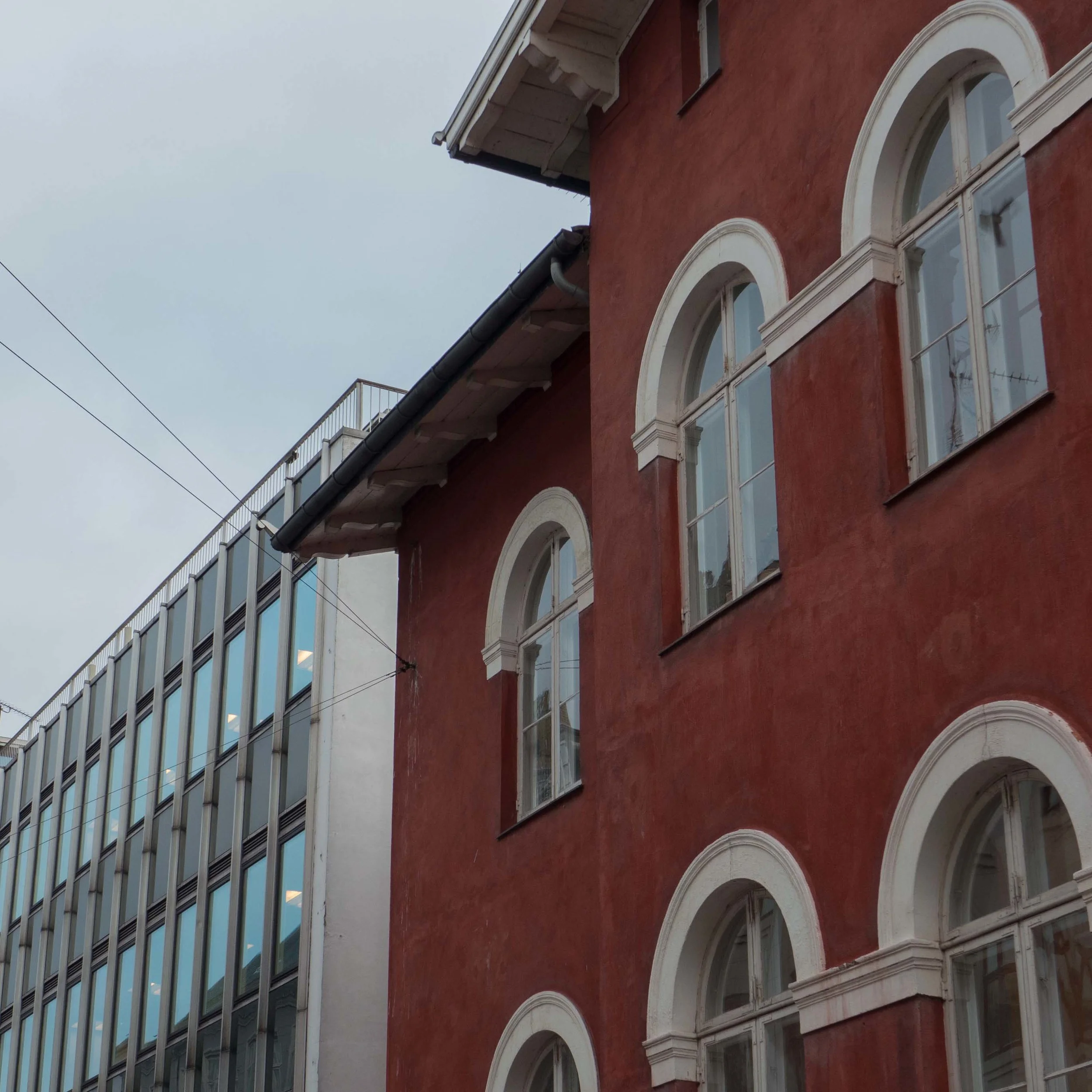
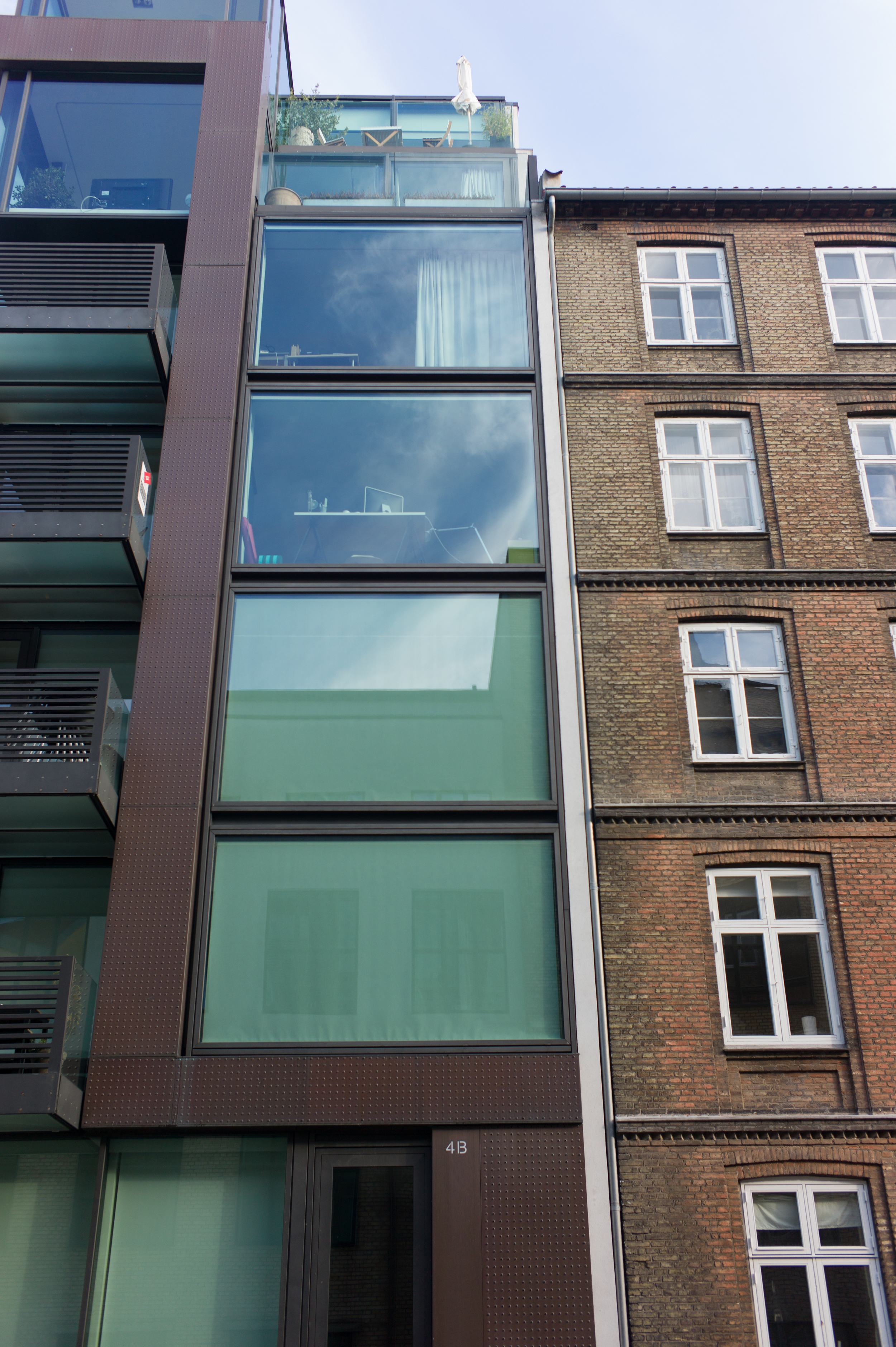
The most obvious feature of historic buildings in the centre of Copenhagen is the control on height. Remarkably few buildings are more than five or six storeys high usually with an additional top floor set in the roof space and lit by dormer windows.
Building materials were generally timber frame or brick and both can be completely covered with plaster although there is plenty of exposed brickwork of a variety of colours and often laid in decorative patterns. Stone is expensive to source and work so generally is used for decoration and key features such as doorways although there are a few stone buildings in the city and a larger number of buildings that are plastered and painted to imitate stone. Roofs are generally covered with clay tiles or slates or copper.
Articulation of historic facades is generally subtle and depends on the vertical alignment of windows and doors, even on a narrow frontage, to create a regular grid of openings. Articulation here quite literally means the way that the architect or master builder used the careful arrangement of simple elements to bring the facade alive or to give a sense of style or make it look elegant or dignified. On some buildings there are vertical elements such as pilasters that are not functional but decorative and many buildings are given horizontal emphasis with plain or moulded bands between the floors and decorative cornices across the top. Some buildings have a different treatment of the wall at different levels usually to emphasise the relative importance of different floor levels.
Colours are actually quite wide in range but pale stone colours and organic colours, such as dark ochre predominate. Sharp, bright modern chemical colours - day-glow pink or lime green - would immediately stand out and look inappropriate.
There is also the important business of texture. Plaster surfaces and historic glass is irregular and uneven which contributes enormously - much more than many realise - and contributes to the character of the streetscape. In many modern buildings one common mistake is to use materials that are too smooth and too perfect, too mechanical and actually rather boring. Modern glass is so perfect and consistent that it either looks like flat mirrors or, when the sheets of glass are large, windows can look like blank holes punched in the wall.
If that list sounds restricting and limiting then just looking at any street in the city shows exactly how wide the variation on a theme actually is.
Finally, I suppose, there is still the ongoing problem that too many modern buildings are designed on a blank sheet of paper - or blank computer screen - when of course in a town they will stand in a line of other buildings. Views from an angle or the appearance across a street or square or from a distance can often be far more important than when a pedestrian is walking directly by hard against the building and looking ahead so barely notices the front.
With CGI it should now be possible to see a proposed building from all angles but that still doesn’t help an ordinary person presented with a scheme and asked for their comments because of course no architect or architectural technician was paid his fee for showing a bad building design truthfully.
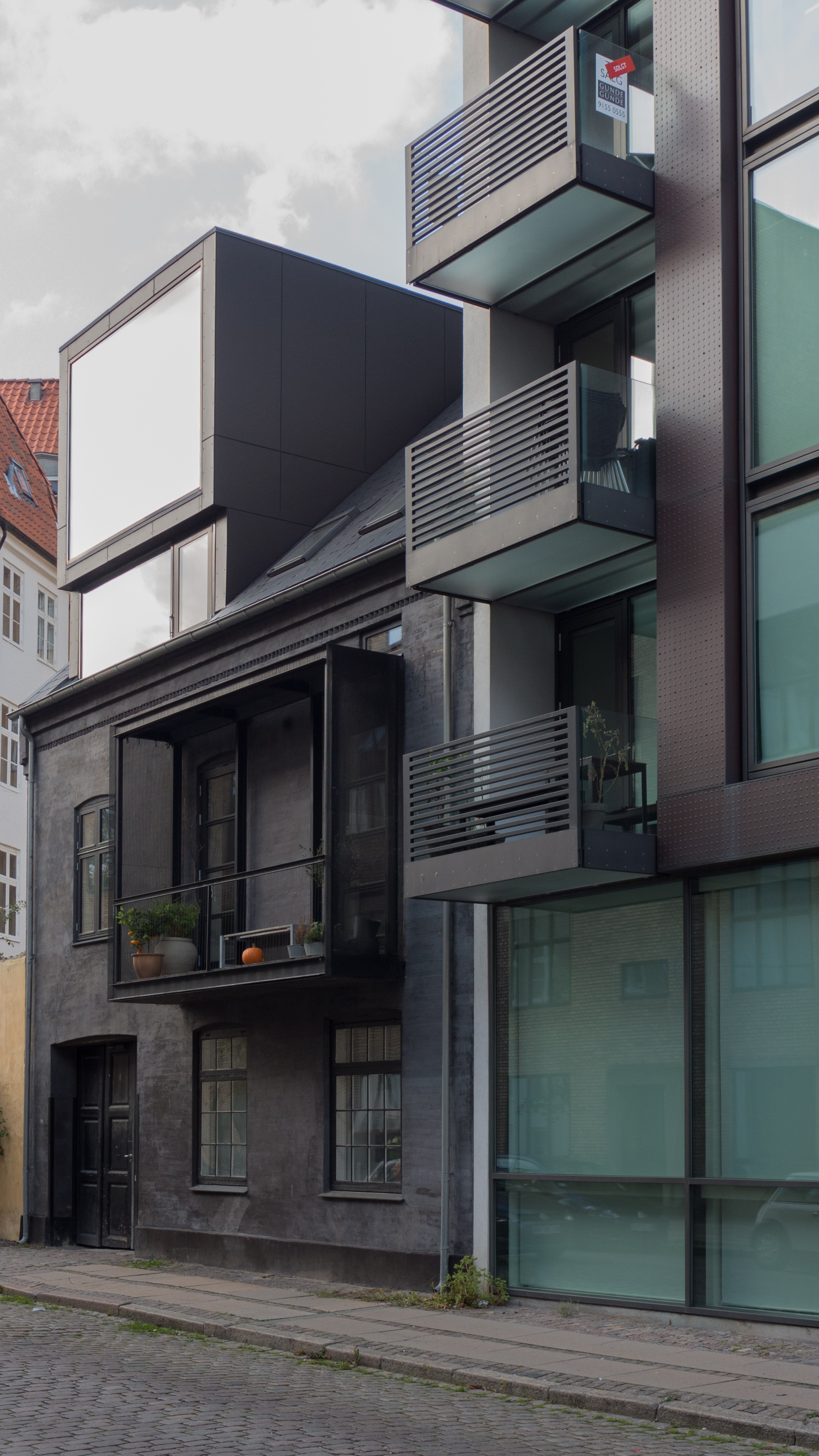
The alignment of the frontage is important so setting a building back may provide space and be seen as a gain when pavements are crowded but setting back a building even by a small distance from the original street line can undermine a streetscape and open up views through to side gables or back buildings that were never meant to be seen.
It should also ring warning bells when a new building is constructed with obviously poor quality materials … it usually indicates that redundancy has been factored in to the calculations.
It is good and it is stimulating to have buildings that are different but if every building is trying to stand out by being different then it ends up like shouting in a noisy crowd … so pretty pointless and rather exhausting.
Architecture of greed or vanity or ego can actually get pretty tiring after a while when you have to walk past it day after day.
Maybe there should be a lottery draw in the planning process and if an architect gets the boring-and-safe card then that is what they have to design because there is something to be said for at least some boring background buildings. Every opera has to have a chorus and one diva too many is one diva too many.
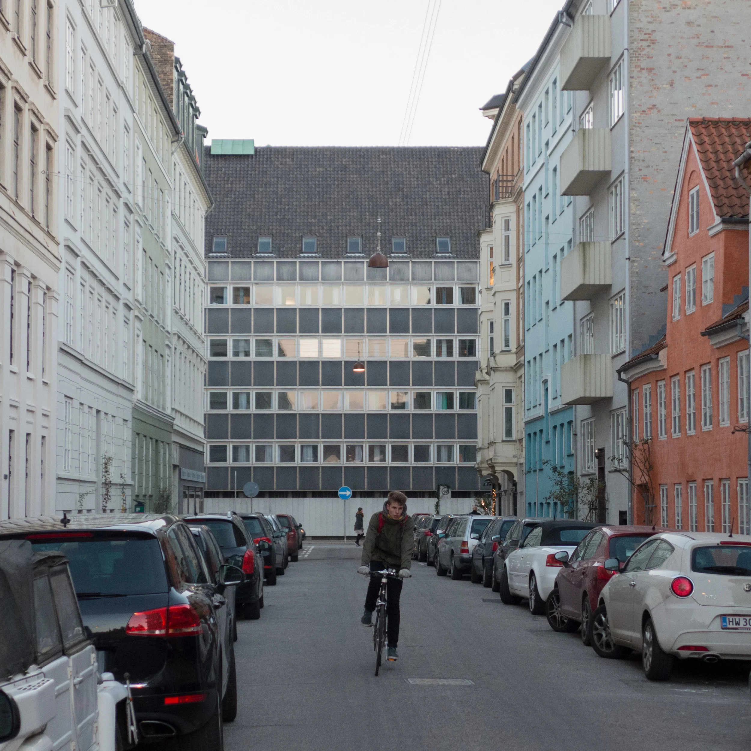
No comments are really needed here except to say that presumably someone somewhere at the time said that that far out on Vesterbrogade it doesn't really matter. The planning policy in the city now seems to be that no area of the city should be left behind.
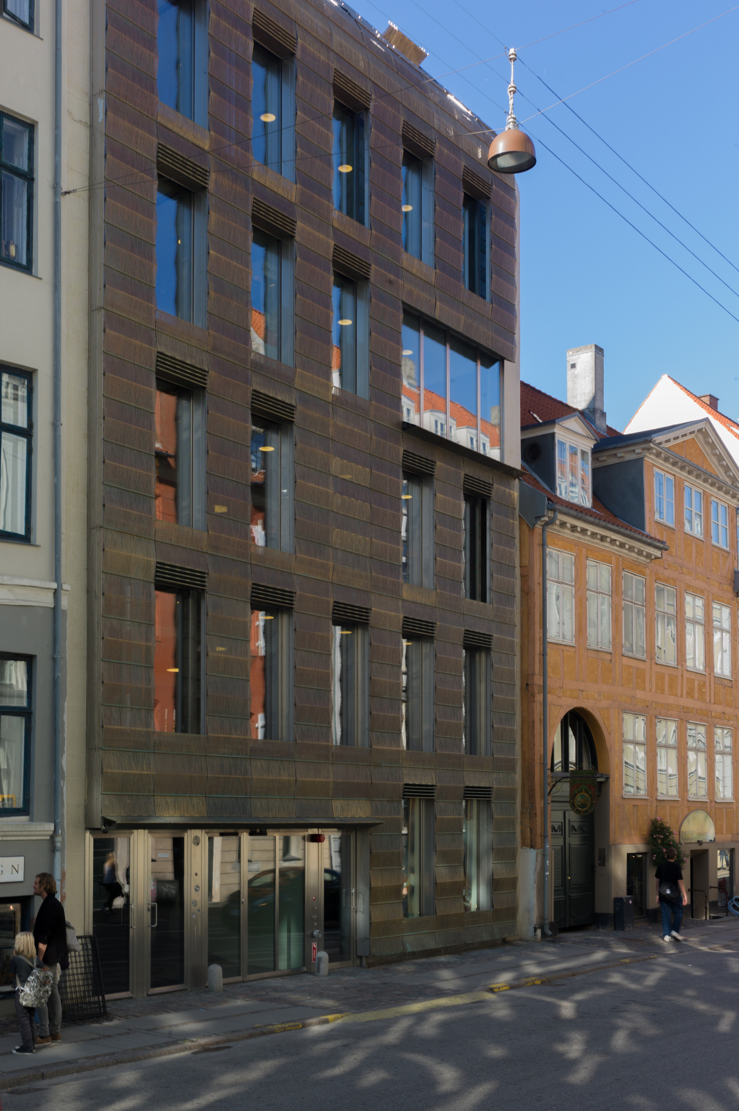
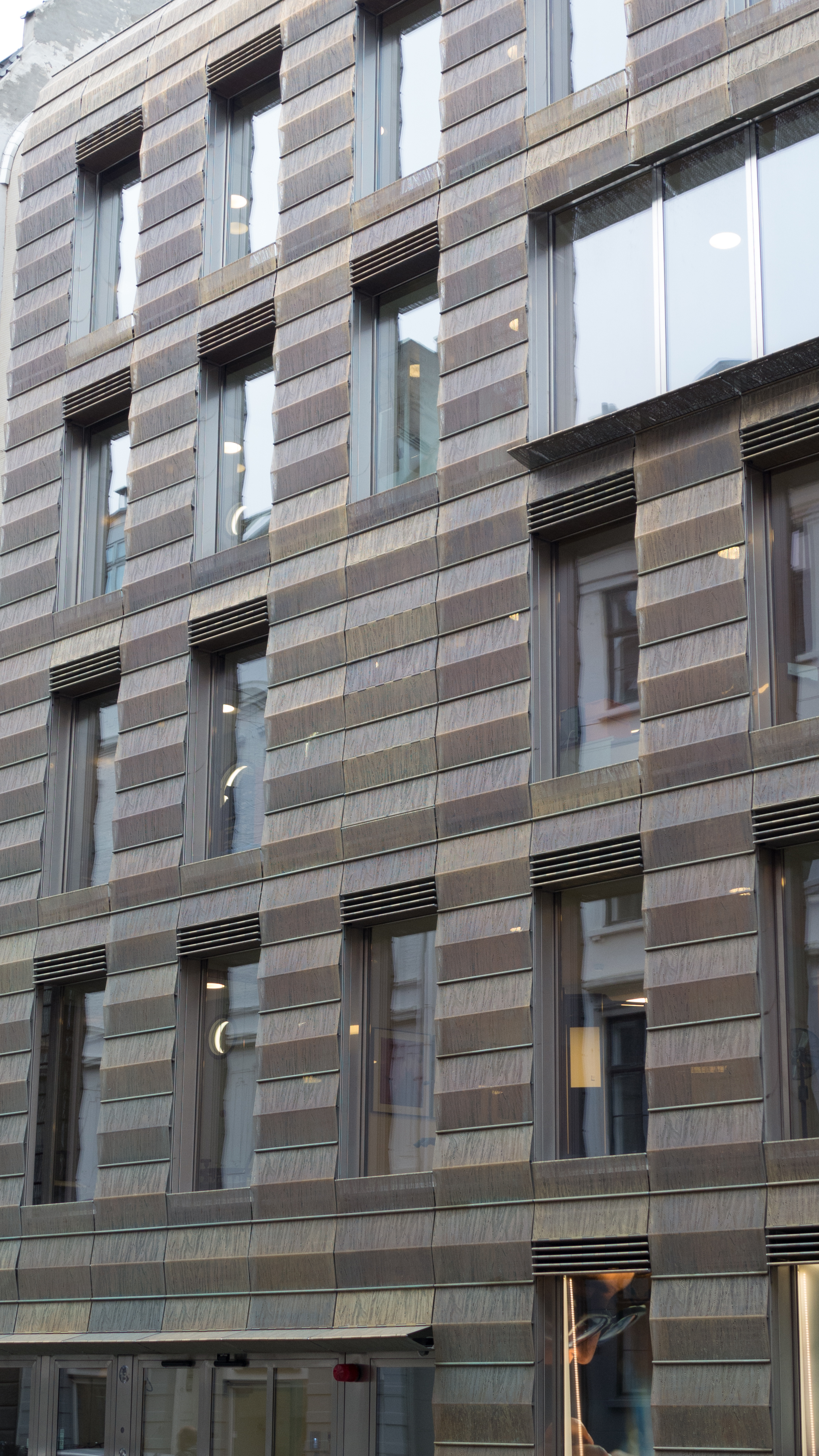
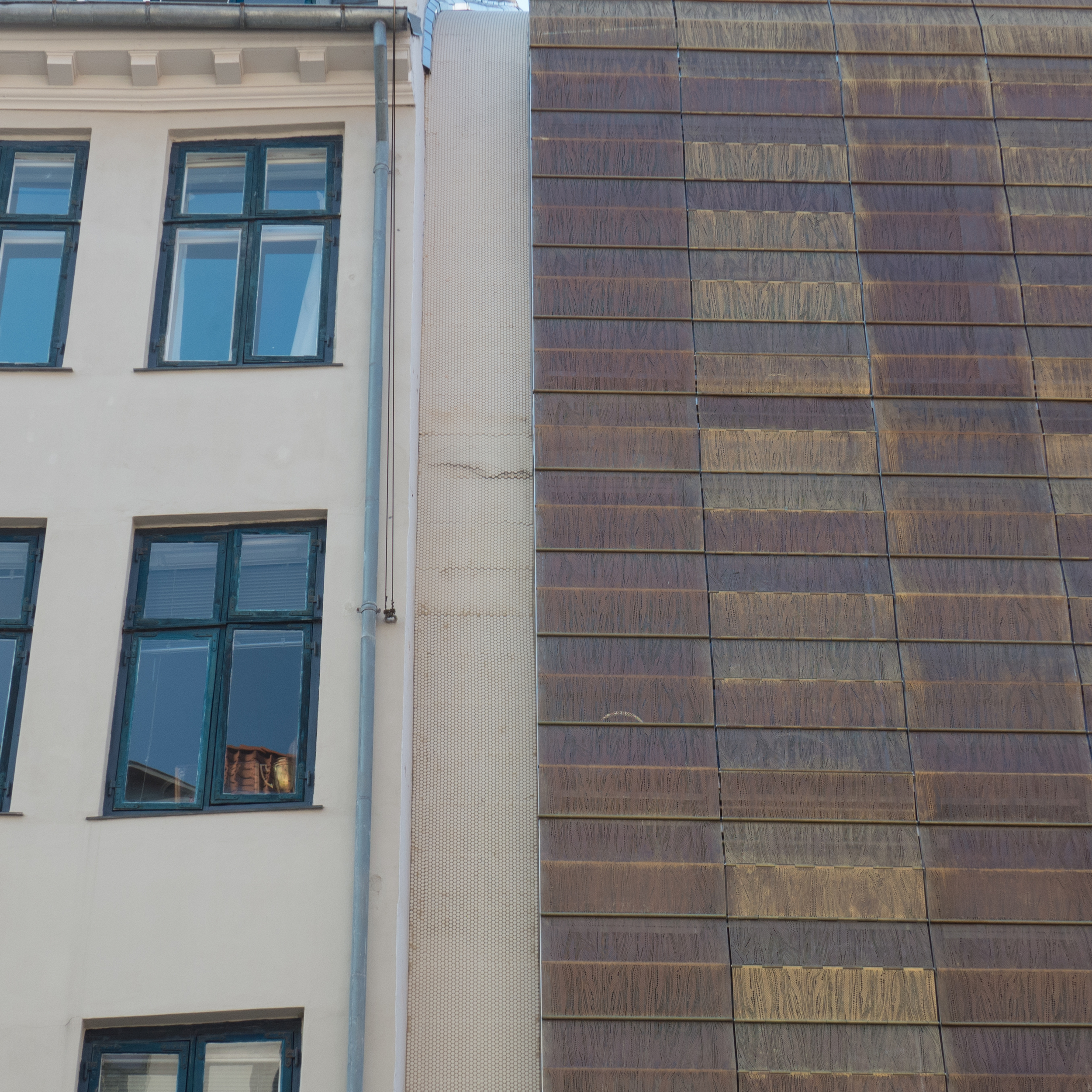
This rebuilding is on Store Kongensgade but actually has more impact on the view down Olmert Fischers Gade shown here.
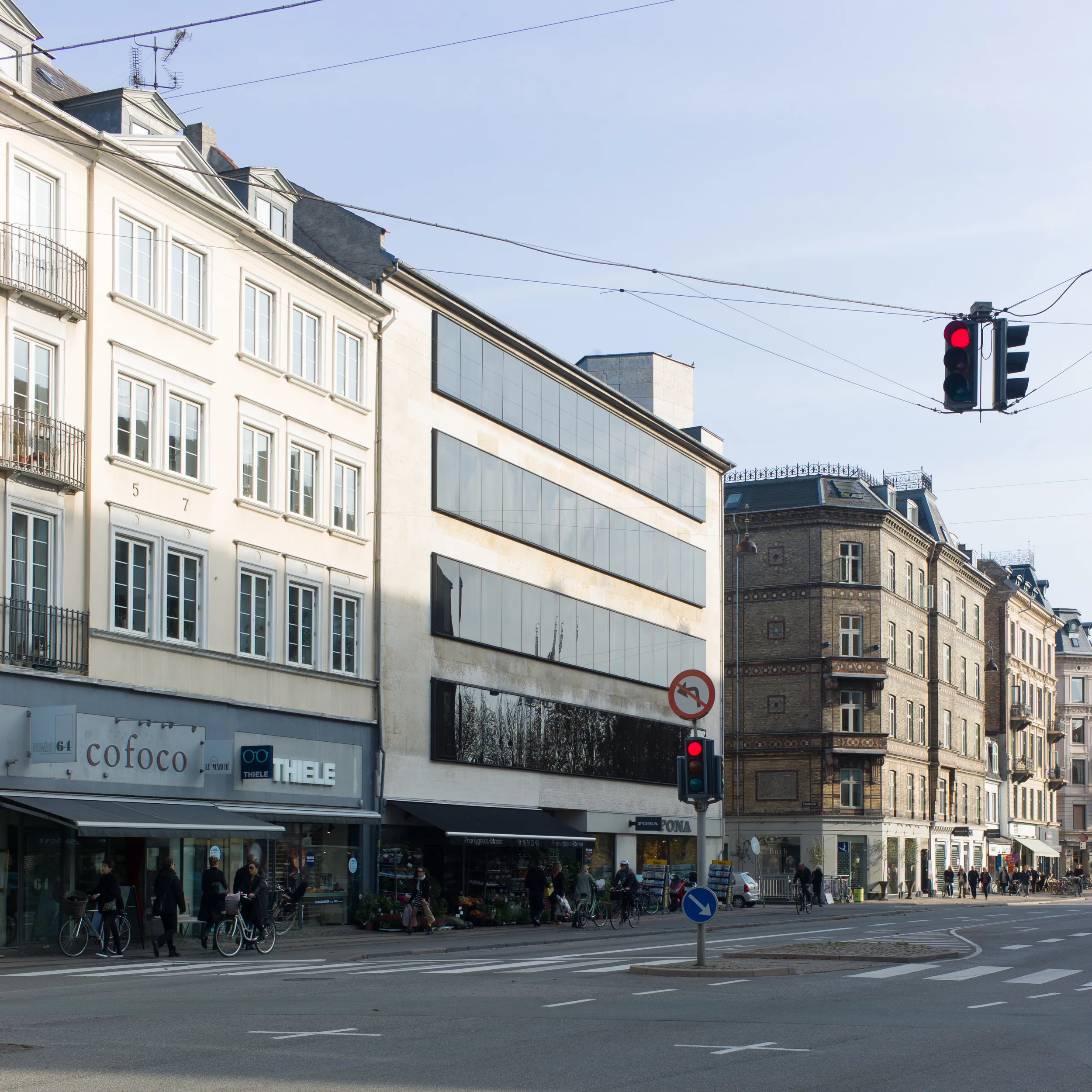
Bredgade is a grand and imposing street with some amazing buildings. The quality of building materials and the colour used here for the new facade is good but I'm not sure that being subtle and setting back the penthouse compensates for the complete indifference to fenestration patterns and levels in adjoining buildings. This facade could be just anywhere and they seem to have thought it was.
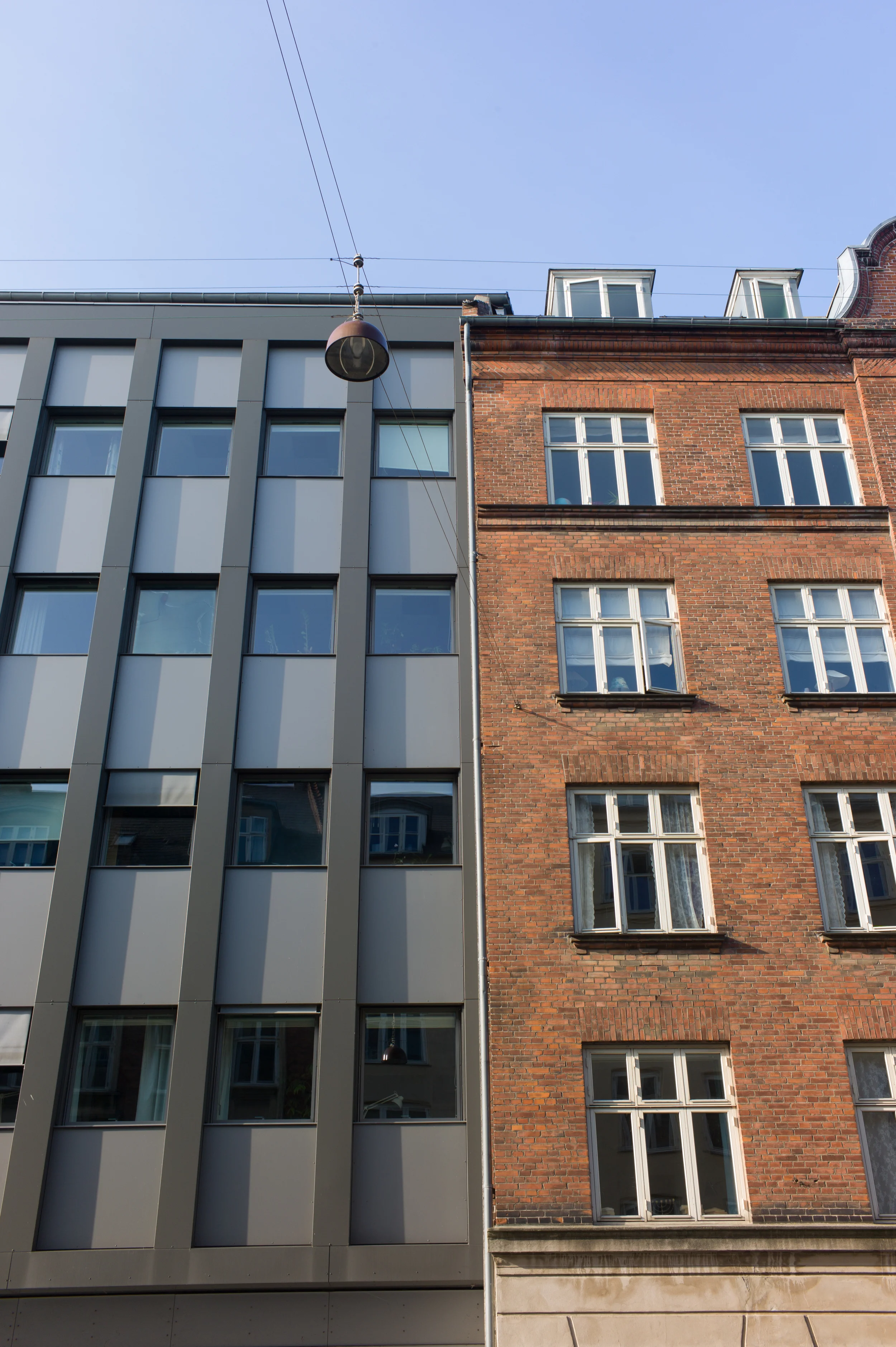
This one is more difficult to judge. The facing material is good but maybe the horizontal emphasis has gone too far and the dark glass is a bit ominous. If a building can be said to be hiding behind dark glasses it is this one and somehow the muddle at street level doesn't disguise the fact that, visually at least, there doesn't seem to be much holding up the front.
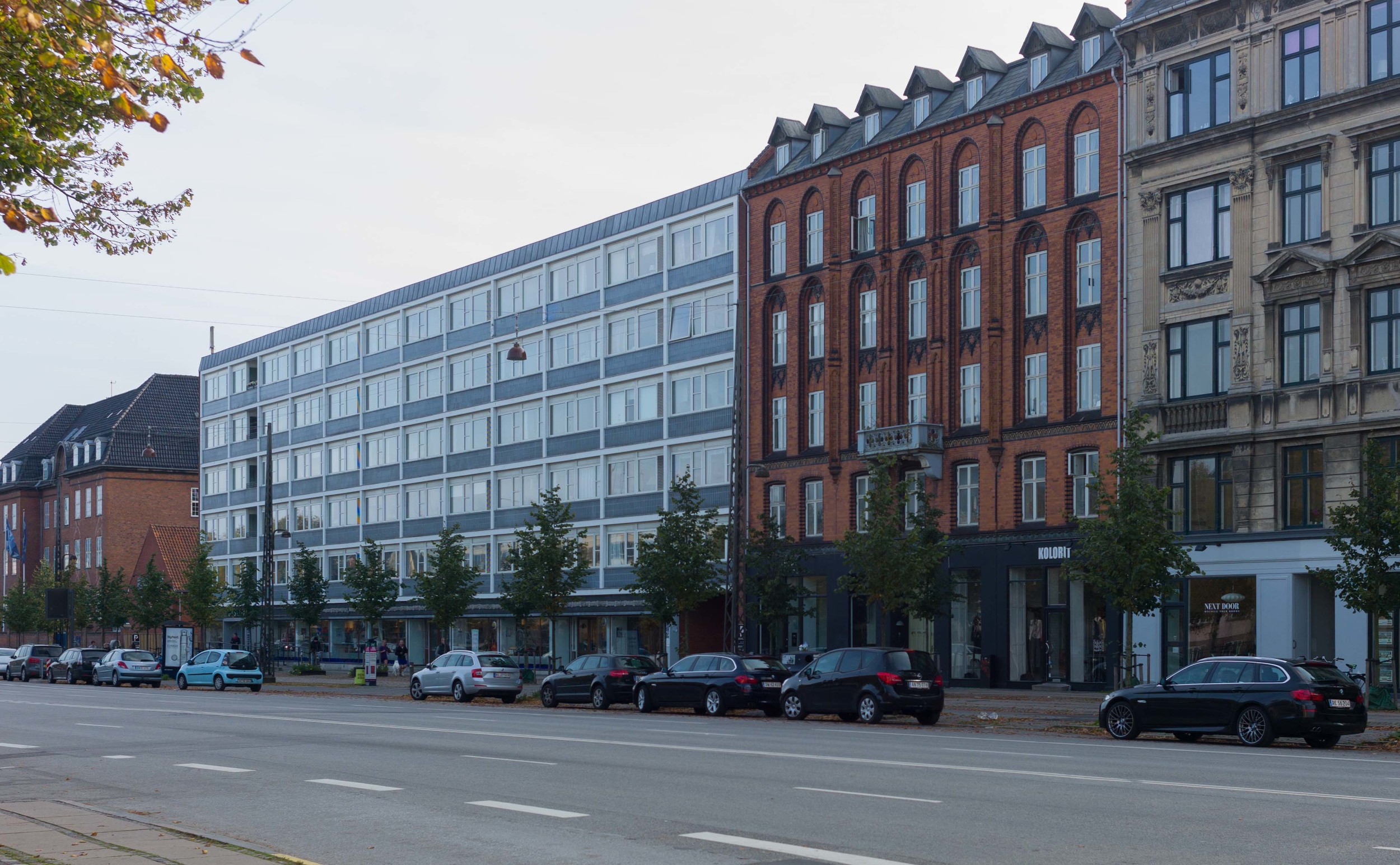
The library and apartments on Dag Hammarskjölds Allé creates an odd change in the rhythm of plot width. Although I have not found any historic photographs yet to show what was on this site, it was presumably a number of narrower buildings ... this feels like the visual equivalent of getting into a rhythm when walking and then suddenly having to take a very long stride.
The relatively recent building on Ryesgade tries hard to get the floor levels to work and the subtle colours of the facade actually means it works well on the street view despite the slight set back and the ground floor, set even further back, does have the visual strength to support the building properly.
Sometimes the juxtaposition of old and new can be like using a spice in a food but sometimes it just jolts.
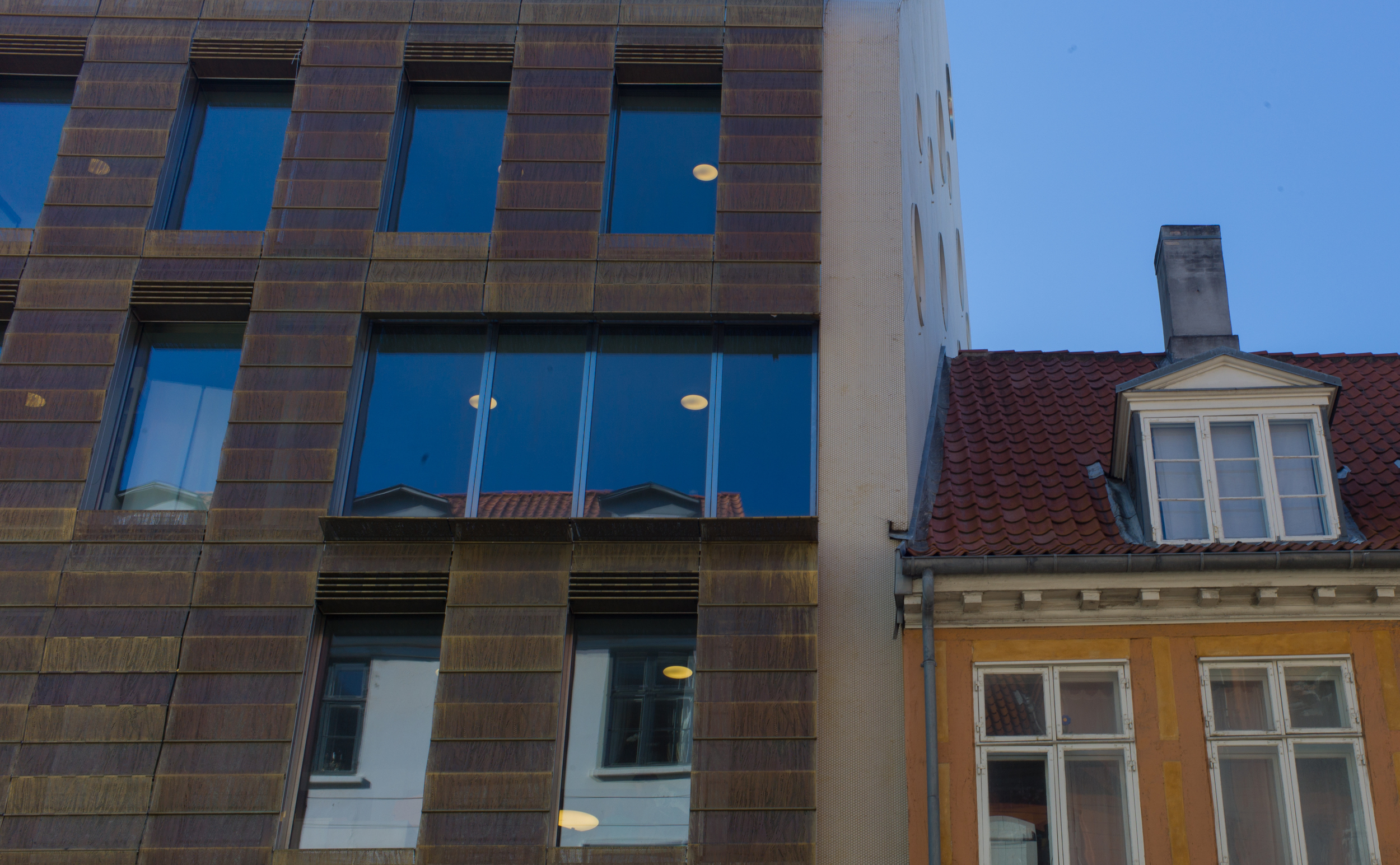
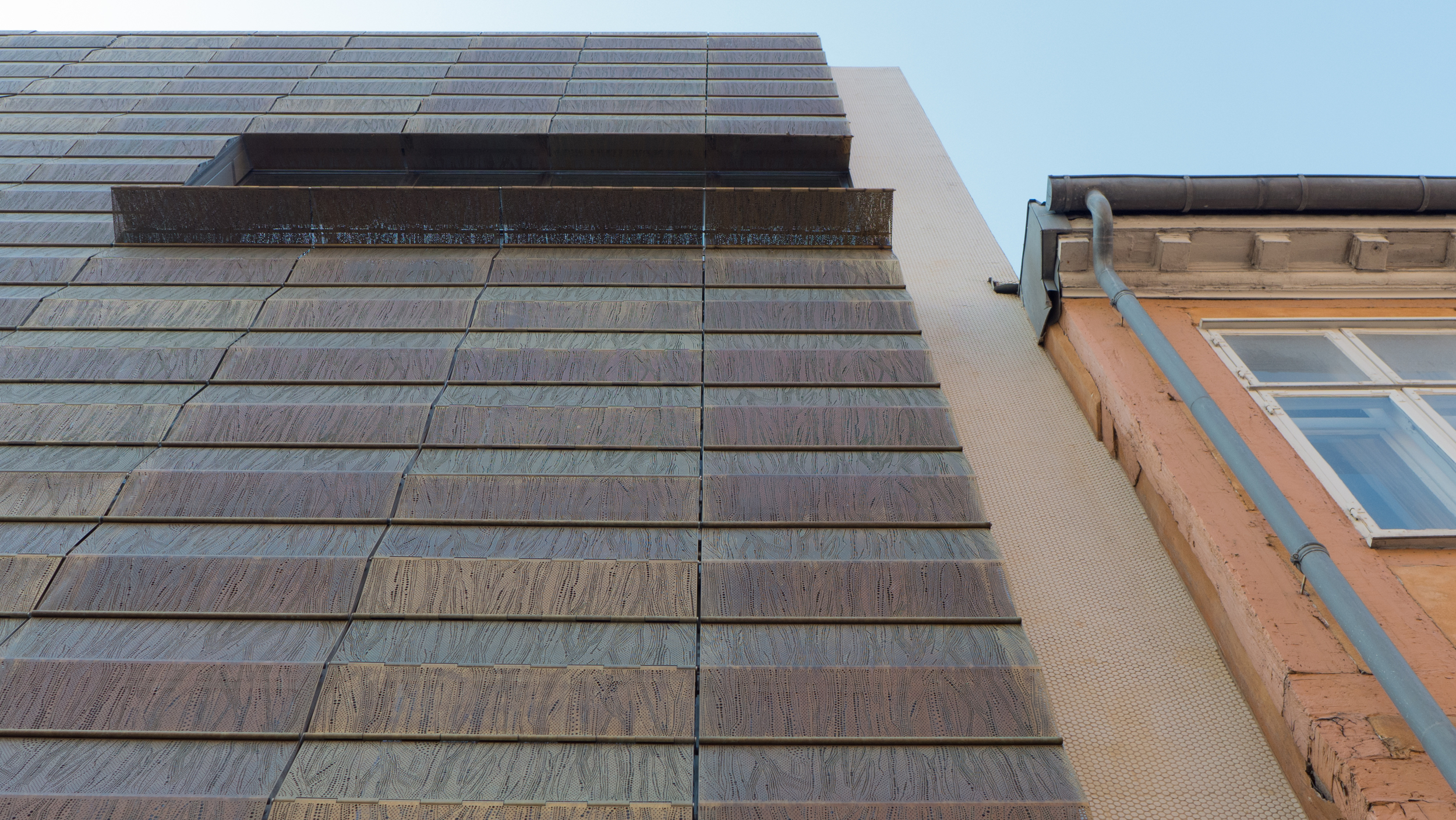


This building on Toldbodgade by BBP Arkitekter has style and courage and a sense of humour as it plays with the Copenhagen feature of window shutters. The pierced louvres can be lowered for security and to control sunlight giving the facade a real sense of vitality. A thin vertical strip acts as a buffer on either side between the new front and the adjoining buildings. This was a new facade added in front of a building that was set back so it also reinstated the building line of the street. This illustrates well the point that the more conventions you ignore, the better the building has to be to compensate.
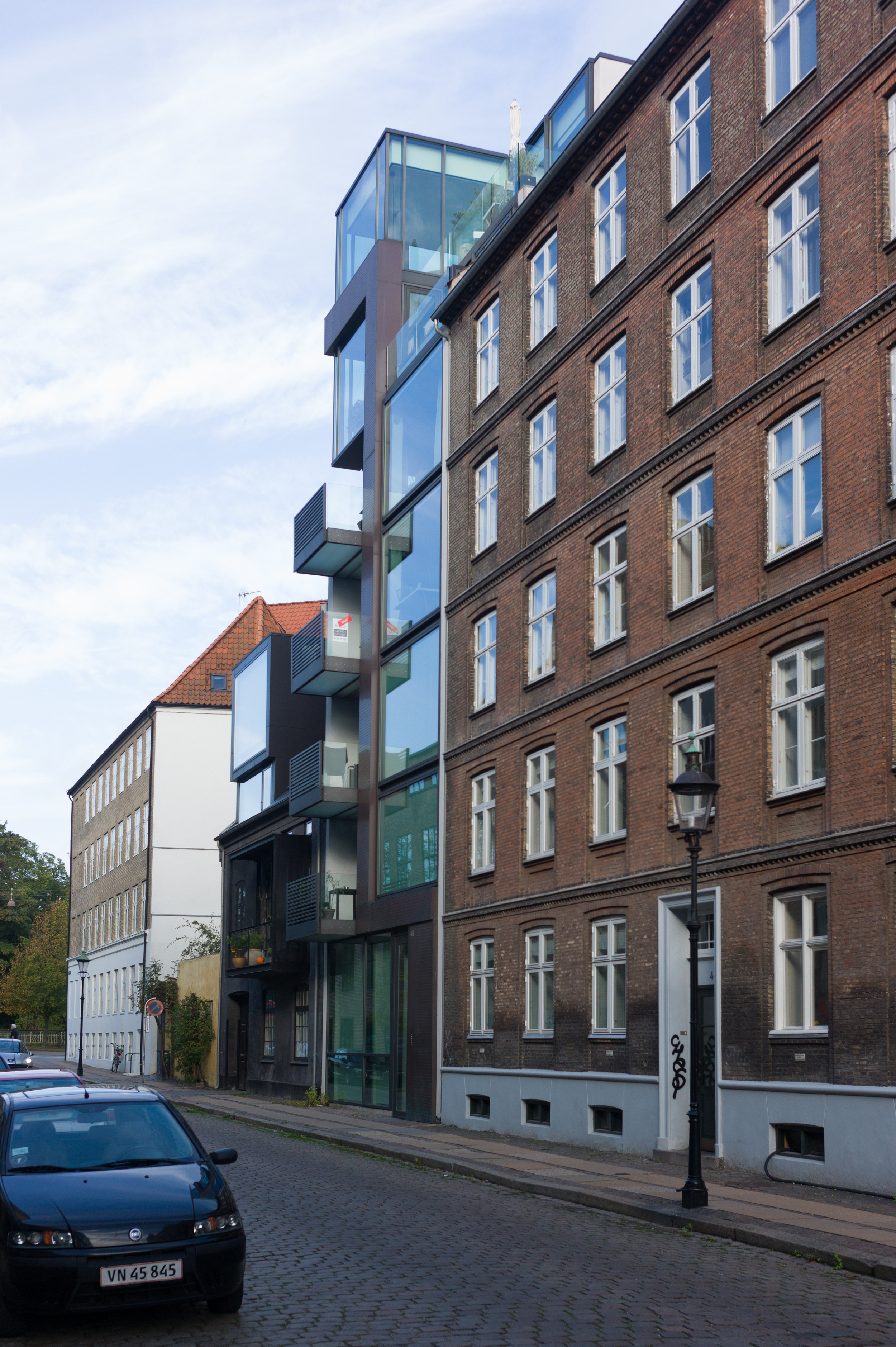

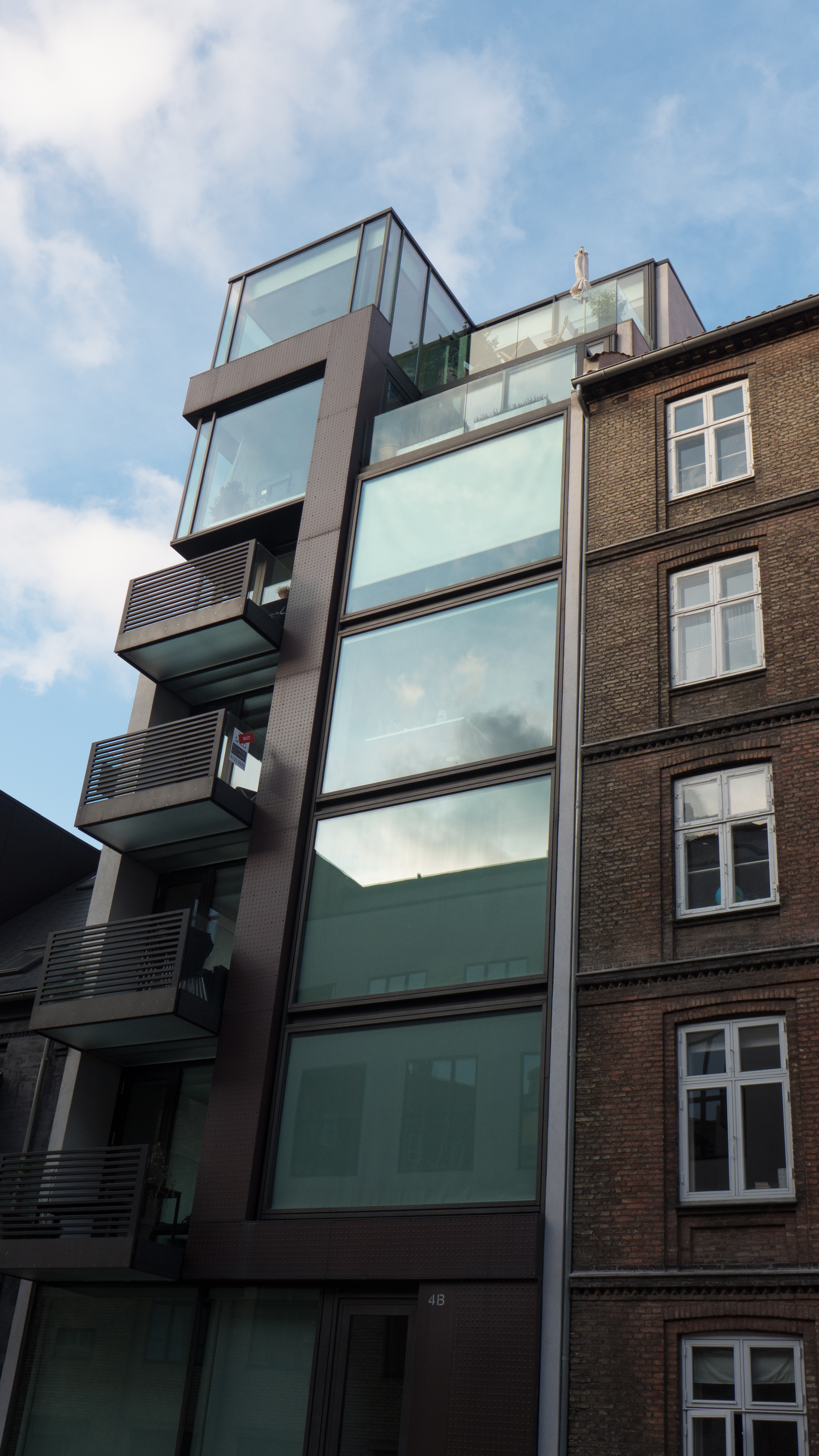
This apartment block tucked away on a narrow plot on Stokhusgade, completed in 2007 by Holscher Nordberg, uses minimalist design of the highest quality and note the way it precisely and carefully respects the floor levels and horizontal details of its older neighbour. The dramatic conversion of the lower property on the left side gives the whole group a strong sculptural feel when seen from the main street, Øster Voldgade, to the north.
My comments are not for architects or planners but for people who are concerned about the built environment in which they live and work but cannot say exactly why they don’t like a building or can’t explain why a building feels wrong or doesn’t work when you go inside. I’m certainly not saying that my view or my taste is right … simply I’m wanting more people to look up from the pavement and wonder why a building is successful … why or how it looks right or why it works or, on the other hand, why a building is annoying them or is intrusive or simply doesn’t do well what it was meant to do.
This post has been about urban infill but of course the opposite sequence of development can be found. This small late 18th or early 19th-century house has been out flanked ... although I'm not sure that out flanked is a recognised and accepted planning term.


