From Infrastructure to Public Space*


Dronning Louises Bro in the evening from the city side

Our Urban Living Room, is an exhibition at the Danish Architecture Centre about the work of the Copenhagen architectural studio COBE with a book of the same title published to coincide with the exhibition, and both are subtitled Learning from Copenhagen.

A general theme that runs through the exhibition is about the importance of understanding a city as a complex man-made environment to show how good planning and the construction of good buildings, with the support of citizens, can create better public spaces that improve and enhance our lives.

One graphic in the exhibition, in a section about infrastructure, shows Dronning Louises Bro (Queen Louise’s Bridge) as the lanes of traffic were divided in the 1980s and compares that with how the space of the road is now organised.  

The stone bridge, in its present form dating from the late 19th century, crosses an arc of large lakes on the west side of the city centre and is the main way into the centre of Copenhagen from the north so many people have to cross the lakes on their commute into the city in the morning and then again in the evening as they head home. In the 1980s vehicles were given priority with 6 lanes for traffic - two lanes of cars in each direction and in the centre a tram lane in bound and a tram lane heading out - so the pavements on each side were just 3 metres wide and cyclists had to compete for space with cars.  

Now, the width of the lanes given over to vehicles has been narrowed down to just 7 metres in the middle for a single lane for driving into the city and a single lane heading out but on each side there are dedicated bike lanes that are each 4 metres wide and then generous pavements that are 5 metres wide on each side of the bridge for pedestrians. So the space for cars and the space for pedestrians and cyclists has been swapped around. The bridge is just as busy - if not busier - with an almost-unbelievable 36,000 or more cyclists crossing each day and the pavements are actually a popular place for people to meet up … particularly in the summer when the north side of the bridge catches the evening sun so people sit on the parapet or sit on the pavement, leaning back against the warm stonework, legs stretched out, to sunbathe, chat or have a drink.


graphic showing changes made to the width of the traffic lanes over the bridge ... taken from an information panel for the exhibition Our Urban Living Room at the Danish Architecture Centre


the bridge looking towards the Søtorv apartments on the city side


* the title of this post is a section heading from the exhibition Our Urban Living Room and a chapter heading in the catalogue

The Danish Chair


Part of the collection of modern chairs at Designmuseum Danmark, has been moved into a newly refurbished space in one of the long narrow galleries in the south wing to the right of the entrance.

The new display is stunning and with each chair shown in a self-contained box and with good lighting and clear succinct labels it is possible to really appreciate each piece of furniture. The chairs are arranged on three levels … the middle row at about eye level, the lower chairs angled up and the upper tier angled down slightly so the gallery has something of the feel of a barrel shape or barrel vault and each chair is angled to optimise the view point for the visitor. Of course, there are some down sides in that it is not as easy to get a sense of the chair as a three-dimensional work but this new arrangement does let you get very close to look at details and for the middle and upper rows it is possible for the first time here to see the underside of the chairs if you are interested to see how they are constructed.

read more

The Danish Chair - an international affair Designmuseum Danmark

Johansen Skovsted Arkitekter at DAC


the entrance to the gallery with model of Tipperne Bird Watch Tower at a scale of 1:10

This exhibition of the work of Søren Johansen and Sebastian Skovsted is the last of a series of three exhibitions in the Dreyer Gallery at the Danish Architecture Centre that over the Autumn have focused on young architects in Copenhagen.

To quote from the pamphlet that accompanies the exhibition: "The series … will give visitors and the industry special insight into the dynamic daily practice and reality of these firms, where creativity and business savvy go hand in hand.”

Clearly, business acumen is important if an architectural practice is to succeed and expand but actually one theme that linked the three architecture studios - Johansen Skovsted, Norrøn and Sted is their strong awareness of place and and a strong empathy for nature that seems to be the starting point for all their work.

For Søren Johansen and Sebastian Skovsted, architecture "is about finding a place in the world and setting the stage for our interactions with each other ... we view architecture as a way to play with the landscapes, cities and buildings, saturated with meaning and history, that makes up the world as we know it. In construction, materials, form and space, architecture becomes the creation of the place anew ... "


the exhibition continues at Danish Architecture Centre in Copenhagen until 15th January 2017

Johansen Skovsted


Skjem Å - Pump Station North transformed as a new visitor facility 

Courtyard Nørrehus, Nørrebro, Copenhagen - many of the large older housing schemes are apartments around a large courtyard that initially had laundry drying yards, dustbins, and, in many, toilet or bath blocks, As the buildings have been upgraded and improved, many of these courtyards have been cleared or rationalised and landscaped to provide important communal garden spaces with play equipment for children, places for eating outside or, at the very least, a quiet pleasant place to look over from windows or balconies

the exhibition included portfolios of presentation drawings ... a good way for a non-professional but interested visitor to see how the schemes evolved and to see some of the technical details ... the real complexity beneath a structure that ostensibly seems quite simple or straightforward


Ordrup … the garden of the landscape designer G N Brandt


While tracking down material about how Arne Jacobsen used geometry and proportion in the process of design - specifically to see how and where he used the Golden Rectangle - there were several intriguing references to work by the Danish gardener, landscape designer and teacher G N Brandt.  

Brandt was a generation older than Jacobsen - some twenty-four or twenty-five years older - and they might not normally have known much of each other’s work particularly in the late 20s when Jacobsen had just finished his studies and just qualified as an architect but in 1927 Jacobsen married Marie Jelstrup Holm whose family lived in a villa in Ordrupvej and in 1929 the couple moved to Ordrup - to a house at Gotfred Rodes Vej 2 that Jacobsen designed and had built for them and where in 1931 he then added a design studio and office for his architectural practice … so for some fifteen years, until Jacobsen fled to Sweden in 1943, he lived and worked just a few streets away from where Brandt lived in Ørnekulsvej. The walk from one front gate to the other is 450 metres so each must have known of the house and the garden of the other.

read more

defining our urban space

A recent post was about a new school - Kids’ City in Christianshavn designed by the architectural studio COBE - where the spaces - both the spaces within the buildings and the spaces outside between the buildings - have to be flexible to respond to a huge range of very different activities - and many of those activities are about creativity and things done together and achieved together.

At the opposite end of Christianshavn, but possibly a world away, is a large city block, that covers more than 10 times the area of the school. A local development plan was drawn up 20 years ago for the site of what had once been an important ship yard and diesel engine works - a tightly-packed group of industrial buildings of different periods and different styles - that were all to be demolished. Now, in their place, there is a line of imposing and expensive commercial office buildings - six blocks lined up along a harbour frontage - and three large courtyards of expensive apartments. But in those buildings and in that plan too there are interesting lessons to be understood about how architects and planners create and manipulate urban spaces and how we, as occupants or as users or maybe simply as citizens walking past, respond to and use those public spaces.

Also, these Christiansbro buildings designed by Henning Larsens Tegnestue seemed to be a good place to end, at least for now, the series of posts on this blog over the last couple of months about cladding on modern buildings. Perhaps more than any other group of buildings in the city, they illustrate an important aspect of modern architecture that is not often discussed in books or in the more general media. That is that we live in an age where the individual - the star architect or the latest iconic building - takes centre stage so we tend to read a facade as belonging to and defining the building … so the facade is the public front to the building behind. On a narrow plot in a narrow city street the public will see and recognise a building from just its single entrance front although on a larger and more open plot, a prestigious new building will have four or perhaps more sides to admire and those facades define the volume of the building and possibly, but not always, define and express how the internal spaces are arranged and used.  

But what you see - and see clearly in the Nordea Bank buildings at Christiansbro by Henning Larsen and the apartment blocks at the end of Wildersgade - is that actually it is the public spaces that are defined by facades and, for people walking through the area or using those open spaces, what is behind the facade is probably not accessible, unknown and, to some extent irrelevant. So, for us, the materials used on the front of those buildings and the design and character of the facades define the urban spaces that we use and move through. At its simplest, a public square or even a space between buildings can be read as a volume - a box without a lid - defined by four walls that just happen to also be four facades. Looked at in that way then maybe our response to the design of some modern buildings should be different. Perhaps we should not see a facade as the interface they, the architect and the developer, provide between our space and theirs but as the walls and boundaries of our space.

read more

office buildings by Henning Larsen and landscaping by Sven-Ingvar Andersson
with the tower and spire of Christians Kirke
photograph taken from the harbour ferry


Our Urban Living Room

Our Urban Living Room - Learning from Copenhagen has been published as the catalogue to the current exhibition of the same title at the Danish Architecture Centre in Copenhagen. The exhibition continues until the 8th January 2017. 
The book is not far short of 500 pages and is packed with photographs and drawings about the work of Dan Stubbergaard and his team at COBE with a dialogue between Stubbergaard and the Copenhagen planner and author Jan Gehl and, in the middle of the book, there is an interesting and revealing discussion between Stubbergaard and his contemporary, the Danish architect Bjarke Ingels.

The layout and form of the book is interesting because it adopts some of the ways that material is now presented on the internet ... so there are various levels of information, extended captions and spotlighting of important ideas that lead you somewhere else and themes that reappear but not within a rigid narrative.

It is a brilliant exercise in communicating complex ideas - so there are graphics with several sequences of drawings that show how solutions evolved and there are simple graphics to show what is actually a complex process to draw out of the confusion of a complicated place the key ideas that might not be immediately obvious … so for the square above the station at Nørreport it is about actually understanding how people really do cut across the space or where they leave their bikes or for the recently-completed development of Krøyers Plads the drawings show how the orientation of historic warehouse buildings along the harbour and the architectural vocabulary of these earlier buildings inspired the final form and orientation of three new blocks of apartments on two sides of an existing basin of the harbour. 


the model of the square above the railway station at Nørreport in the exhibition at the Danish Architecture Centre


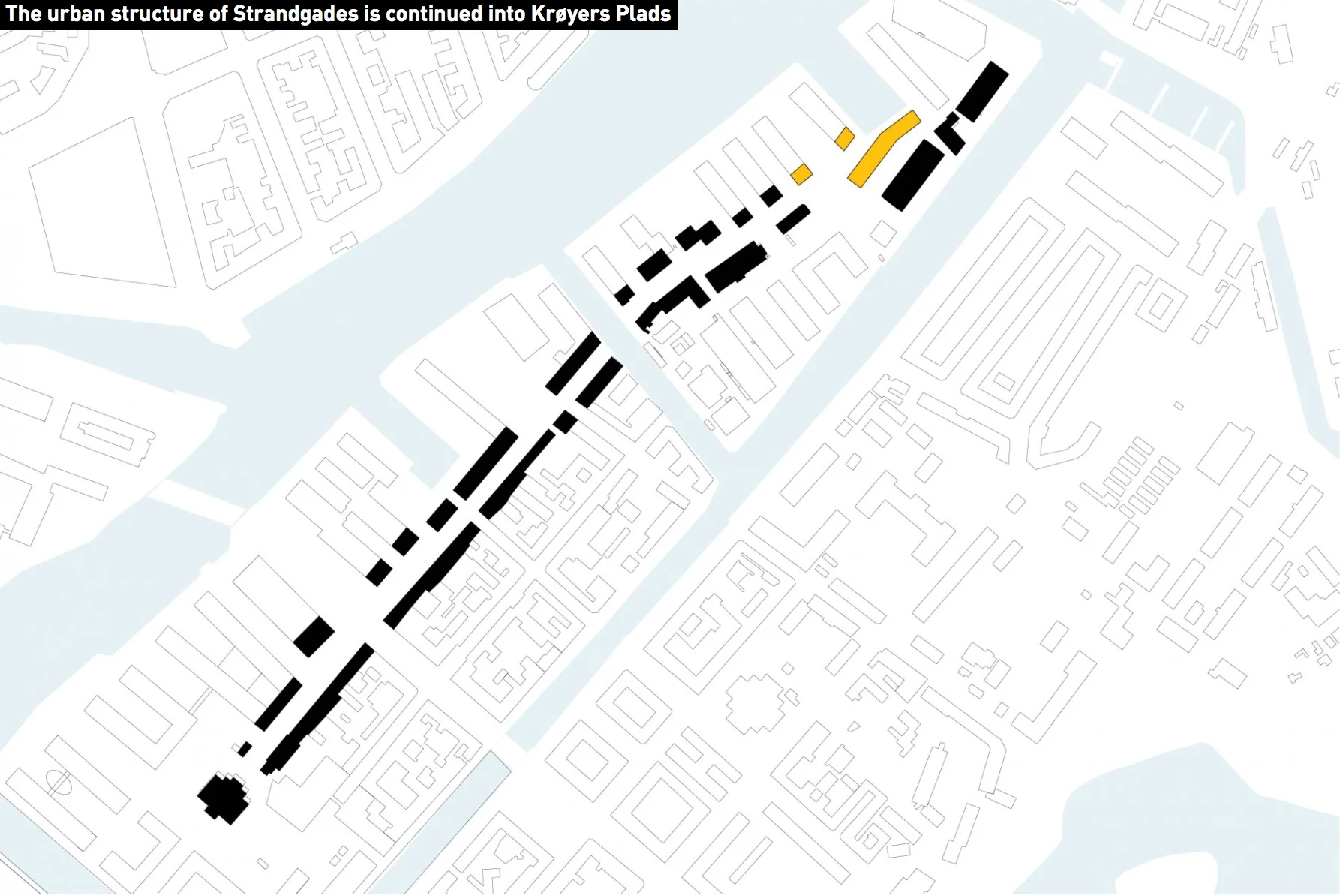
a sequence of drawings to explain the arrangement of the three new apartment buildings and the new public square at Krøyers Plads from the COBE on-line site

There is a sequence of drawings for Krøyers Plads that COBE publish on their internet site that did not make it into the book or the exhibition but they show how the architects look at an extensive area - a surprisingly extensive area - to understand the wider existing urban context of their new buildings.  So for Krøyers Plads they not only looked at how the harbour immediately around the site had developed but also looked at the whole length of Strandgade - the spine of the harbour side of Christianshavn. There is an incredible mix of complicated buildings along Strandgade but COBE simplified the streetscape to the outline shape and the orientation of the buildings, stripped of detail, and by doing that revealed an underlying order and a potential new relationship between one end of the street and the other … a relationship between a tall narrow building - an important 18th-century church tower and its spire, and the space of a square in front of the church - that is at one end of Strandagde and at the other end a new arrangement of a new public square they are creating at Krøyers Plads with the tall end elevation of one of the new apartment buildings as a key element.


In the exhibition at the Danish Architecture Centre there is a wall of CGI images that appear to have been annotated and doodled on in the course of a discussion and on one view of a rather different proposal for the Krøyers Plads buildings you can see a felt-tipped sketch of this Strandgade axis


At one point in the book Stubbergaard says, "I believe we have come to read architecture" but he also understands just how important it is to explain that to people … to explain what they, as architects, are trying to do and why. The book tries and succeeds in showing his thought process as his ideas evolved for certain projects and it is clear that in a discussion Stubbegaard wants to take the listener or the reader to the same conclusion for the same reasons … what appears to be important to him is the idea of architecture by consensus.

He is inspired by architecture and appears to be exceptionally good at explaining his views and ideas and at one point in an interview he talks about how much benefit could come from teaching about architecture in schools.

Headings for the separate sections of the book and the sections of the exhibition are revealing so they are:

  • From Infrastructure to Public Space

  • Culture as a Social Engine

  • Transformation as Resource

  • A City for Kids

  • Architectural Democracy

  • Copenhagen Tomorrow

The book ends with an important and revealing interview with Stubbergaard with Marc-Christopher Wagner where he explains that architects have to have confidence:

"As architects, we must be able to interpret, moderate, to be communicative and able to pull together a lot of people. Architecture today is so much more than drafting lines and building models. It demands enormous social skills, both internally and externally. We have to be able to manage enormous budgets, coordinate complex logistics and physical situations on society's behalf."

It is that last phrase … "on society's behalf" … that is probably crucial if you are trying to understand what COBE are trying to do through their work.

When asked if COBE has a signature style Dan Stubbergaard replied that the main characteristic of their projects is that "they are not recognisable" … and goes on to explain that the idea of iconic buildings is foreign to him.

Is that completely true? The conversion of The Silo in the Nordhavn area of Copenhagen will see a well-known feature of the dock skyline become a key building of the area that will be fairly iconic and the back catalogue is putting together some buildings with distinct family features ... the piling up of small units of a domestic scale to form child-friendly schools at Frederiksvej Kindergarten and Kids City or the stacking up of large metal boxes at Library Nordvest or the Danish Rock Museum.

What comes across so well in the book is the importance of the city itself in Stubbergaard's work so hence the title of the exhibition and the book. He explains that, "Copenhagen is our laboratory, our playground. This is the place where our architecture was allowed to unfold and develop. Knowing the city, the culture, Copenhageners, is a prerequisite for experiment and new thinking, for being bold, even radical in the creative sense of the word."

He has a deep understanding of the city - a sense of the place, an understanding of the history and the people of the city that formed the buildings and how those buildings influence the way that everyone lives so he looks at how people use their built environment and is clearly focused on how the city will influence what the next generation does next.  

Although he is a designer of innovative modern buildings he also understands the importance of learning from the past. He is "personally very interested in historic buildings, because they reflect their times and contemporary society" but is also refreshingly honest about how much control architects have over how their buildings will be used after they hand them across. "What an architect imagines, drafts and plans is one thing, but life itself is powerful and unpredictable. It will take over a building."

So he has an awareness not only about how people actually do move around the city and use its buildings and its public spaces but he is working hard to take his observations and his perceptions and ideas forward to use new buildings and new public spaces to improve the way people can live in the city, to merge as a whole "function and surroundings" which are his "particular source of inspiration."

As Stubbergaard explains in the forward, the book is a 'compendium' of what these architects have learnt from their urban experiments in Copenhagen.


Our Urban Living Room, Learning from Copenhagen
Arvinius + Orfeus Publishing AB
published 2016 - ISBN 978-91-87543-39-5

COBE


Kids' City Christianshavn by COBE


the front of the school to Prinsessegade - the yellow box-girder structure is courts for sports over the main entrance and the glass roof structure is a greenhouse over the restaurant

The first stages of Kids’ City - buildings along Princessegade in Christianshavn in Copenhagen - have opened although there is still construction work on part of the site and work on hard landscaping and planting is ongoing but already it is clear that the design of this new school will be innovative and inspiring. 

When finished there will be up to 750 children here, ranging in age from babies in the pre-school area through to young adults of 17 or 18 in their last years of schooling so Kids’ City will be the largest ‘pre school and youth club’ in Denmark. 

That presented COBE, the architects, with distinct challenges. On a relatively tight plot of around 11,000 square metres, the buildings have to be extensive but have to allow for as much space as possible outside for sport and play and other activities. As a single unified block it could have been over bearing and even rather daunting for small children but this school also has to provide an appropriate setting and the right facilities for such a broad range of age groups that it could never be a place where a one-class-room-fits-all approach was possible.

The solution has been to link together a number of simple blocks, most of two stories and some with gabled roofs and some set at angles to create groups and small courtyards and to treat the site as a small city with different neighbourhoods and public spaces. The separate parts are even described as if they are the distinct and recognisable elements of a diverse but well-established community so rather than an assembly hall or school hall there is a Town Hall; rather than a dining hall or canteen there is a restaurant,  and there will be a stadium and a library and a museum and even a fire station and a factory.

Play and fun are an incredibly important part of the whole scheme so there will be a beach along a canal where there will be canoes and places to have a bonfire "to roast marsh-mallows." 

read more 

Krøyers Plads by COBE

As at the Pakhus by Lundgaard and Tranberg on Langeliniekaj, the development designed by Cobe and Vilhelm Lauritzen Architects at Krøyers Plads takes the historic brick warehouses along the inner harbour in Copenhagen as inspiration but the interpretation could hardly be more different.

Where the starting point for the Langelinie Pakhus was the scale of the earlier warehouses but otherwise the site was open with few other buildings to take into account, the Krøyers Plads site is at the centre of the harbour and within the historic district of Christianshavn and previous designs by a number of different architects for the development have been much more difficult and controversial.

read more


shouldn’t we talk about architecture more?


What a building looks like is important but in the end a building has to be judged by how it works - judged to see if it is doing what it was meant to do - not judged just by how it looks in a presentation drawing or in a beautiful photograph taken in exactly the right light. We judge a building by how it relates to either the crowded busy street in which it stands or to it’s landscape setting.

To understand a building you need to walk up to it, walk around it and walk through it, and, if possible, see it at different times of day and in different seasons.

And it helps if you can look at a number of buildings by the same architect to put the work in some sort of context … it’s that old ‘compare and contrast’ exercises we had to do in English lessons when I was at school though I’m not sure if that sort of thing is still on the curriculum.

read more

the origin of a modern Danish aesthetic?

In the Spring and through into the early summer, there was an important exhibition of the works of the Danish artist Vilhelm Hammershøi at the museum and gallery at Ordrupgaard which is just to the north of Copenhagen. With the title At Home with Hammershøi, the exhibition focused on an amazing series of paintings of interiors that he produced when he and his wife were living in an apartment that they rented in Strandgade in Christianshavn from 1898 through to 1910. 

The rooms have plain walls that were painted in soft greys or creams with all the woodwork simple colours - rather than picked out with any gilding - and furniture is relatively simple, set back against the walls, although they had a piano, at least one bookcase and with a few small paintings and simple pottery. This is in marked contrast to photographs and paintings that survive of what must have been more typical middle-class homes in the city with carpets, heavy curtains, upholstered furniture and banks of paintings on the walls.

Was Hammershøi reacting to the clutter of rooms in middle-class homes of the late-19th century? Was it simply that furniture was carefully rearranged for the painting? Was it a consequence of poverty or, at least, the relative poverty of an artist although he came from a middle-class family and while they lived in Strandgade, Hammershøi spent time in London and in Rome. These paintings are certainly not about ostentatious affluence. Whatever the reasons for their restrained good taste, they do seem to reflect a clear and recognisable Danish design aesthetic and these are interiors that we can appreciate as distinctly modern.

read more


Interior in Strandgade, Sunlight on the Floor painted in 1901 by Vilhelm Hammershøi (1864-1916) in the collection of Statens Museum for Kunst in Copenhagen


when was modern?


There is a problem … what do I call modern architecture? Perhaps the obvious answer is to just call modern architecture modern but then design historians talk about Post-Modern architecture from the 1980s and early 1990s so surely anything more recent has to be post post modern? Or is that just trying to be too rational?

For me I couldn't possibly be old fashioned so one way of looking at this is to say that anything that was designed since I was 15 is modern. But then my modern can't be your modern unless you were 15 when I was 15 which is possible but a bit of a coincidence.

Why 15? Well that's roughly the age when adolescents seem to have developed both a more realistic sense of time and history and an interest in fashion and a sense of a personal style … before that it tends to be just wanting exactly the same things as everyone else in their class at school.

read more

Experiencing Architecture


Steen Eiler Rasmussen was a Danish architect, a planner and a professor at the School of Architecture in Copenhagen who travelled widely including to China. Om at oplev arkitektur was published in 1957 and the edition in English, Experiencing Architecture, came out in in 1959.

Humane and gentle, in a scholarly way, his book is about as far as it is possible to get from a linear history of architecture: he includes discussions on subjects from the baskets of a Cherokee Indian reservation to not being able to sing in the bathroom at the Faculty Club at the Massachusetts Institute of Technology when he was teaching there because the acoustics were muffled. He analyses how we piece together our impression of a building by using our experience of other buildings or our appreciation of materials or what we understand about certain forms of construction.

Along the way, there is sharp and perceptive analysis - so for instance on the differences between buildings by Le Corbusier and Mies van der Rohe … Rasmussen thinks it is because of the very different ways they appreciated how planes define a space.

And there are some pithy observations such as his view that …

"Architecture is not produced simply by adding plans and sections to elevations. It is something else and something more. It is impossible to explain precisely what it is - its limits are by no means well-defined. On the whole, art should not be explained; it must be experienced."

read more

Mindcraft16

This exhibition was shown first in Milan in April 2016 as one of the events of the annual design week in the city. As with the comparable exhibition last year - Mindcraft15 - it was curated and the display was designed by GamFratesi - the Danish Italian design partnership of Stine Gam and Enrico Fratesi. It was organised by the Danish Arts Foundation and the Agency for Culture and Palaces.

There are works here from 17 designers or design studios and the pieces demonstrate not only a very high level of craftsmanship but the works in different ways explore boundaries we seem to impose between craftsmanship and product design and art. Materials include ceramic and wood and textiles but there is also a light installation and music.

The main theme is the imagination and the intellectual process of design - that balance between understanding the materials and the techniques to be used but then wanting to push boundaries - to question, to inform, extend and develop ideas and challenge our preconceptions about how something should look and question what we want and why and how we value art and craft works and how we use objects. It’s about alternatives and discovering new possibilities.  

read more

Mindcraft16 at Designmuseum Danmark in Copenhagen until 8th January 2017

Mindcraft16 ... Sølvgade Chair by Cecilie Manz


The Sølvgade Chair by Cecilie Manz - when seen alongside the other works in the Mindcraft16 exhibition - appears to be the most conventional piece because it is restrained, rather self-contained and certainly does not draw attention to itself. In contrast, many of the other pieces are deliberately flamboyant and deliberately controversial to push conventions and to challenge the visitor. 

However, the design of the chair goes in the other direction by taking the design of a chair back to basic principles it raises interesting and important questions about how designers and manufacturers should approach the production of a new chair. Why is that important? Well, a chair is perhaps the staple piece of furniture and usually has a major place or even an iconic place in the catalogues of the major Danish design companies. New chairs are launched at regular intervals and old designs are revived as a matter of pride in a well-known back catalogue. Most design buffs can reel off a list of classic chairs but would find it more difficult to name more than a couple of classic table designs or a couple of sofas.

read more