my Safari bookmarks are in better order than my book shelves


One problem with still buying design books is that they tend to spend weeks ‘filed’ like this … the stack of newly-bought books just next to my desk. At least they are in easy reach.

For several years I worked in an office with an archaeologist who seemed to spend every lunch break buying books. He had run out of book shelves at home - or rather he had run out of walls without windows or doors where he could put book cases. His first solution was to double stack books on each shelf and after that leave a pile of books on each step of the staircase. When he ran out of empty treads his wife finally gave him an ultimatum … no more books. He agreed but perversely felt that the opt-out clause of the agreement was to leave all new purchases in the office. That was fine until the day he retired and he had to clear his office and take several car loads of new books home. Sorely tested his marriage.

I’m nowhere near that bad but have just found these book ends from Norrgavel in their Malmö shop which means I can at least put the piles of books on the window sills in some sort of order. The book ends are oak with a base and support in powder-coated steel … strong, beautifully made and quite simple and subtle. Neat design solution for now … until of course the window sills fill up.

design books or design blogs?

The shelf just next to my desk ... mainly reference books that are kept to hand but the odd new book that found a space and all a bit as it came out of the boxes when I moved in 9 months ago


With the recent exhibitions at the Danish Architecture Centre and at Designmuseum Danmark I have been thinking a lot about how complex information and particularly how ideas about design and architecture can be best set out in museums and in books and on line.

After graduating I did a university diploma course in museum studies and we discussed the presentation of information quite a lot. It is clear that visitors to museums and galleries look at collections and exhibitions in different ways and the design team have to think about that very carefully. Some visitors walk through quickly even if that is simply because they are aiming for another part of the museum collection. At most, if their eye is caught by something, they want a brief label giving artist or object use or period or country of origin but even then they may want more.

In a focused exhibition many visitors have come specifically to see that show and they may have quite a lot of knowledge about the subject so a second level of more detailed information is necessary but even that can swamp the display visually or deter the less dedicated visitor and you still have to cater for the person who is interested but doesn’t know much so still needs the basics. 

Leaflets or information on a board or bat in each area can be useful but how much information is enough or too much? And if you watch next time you are in a gallery with information sheets very few people pick them up. 

Audio tapes are one possibility and links picked up by the visitor’s own phone can be useful but again how much information is enough or too much? The visitor can feel as if they are being herded through and then of course, as with data on line and with blog sites, the authors have to do a lot of work to produce a lot of information that people will either never ever look at or will listen to or look at and say “so what” … tell me more. There are amazing statistics about how many tracks on Spotify have never ever been listened to … by anyone … anywhere.

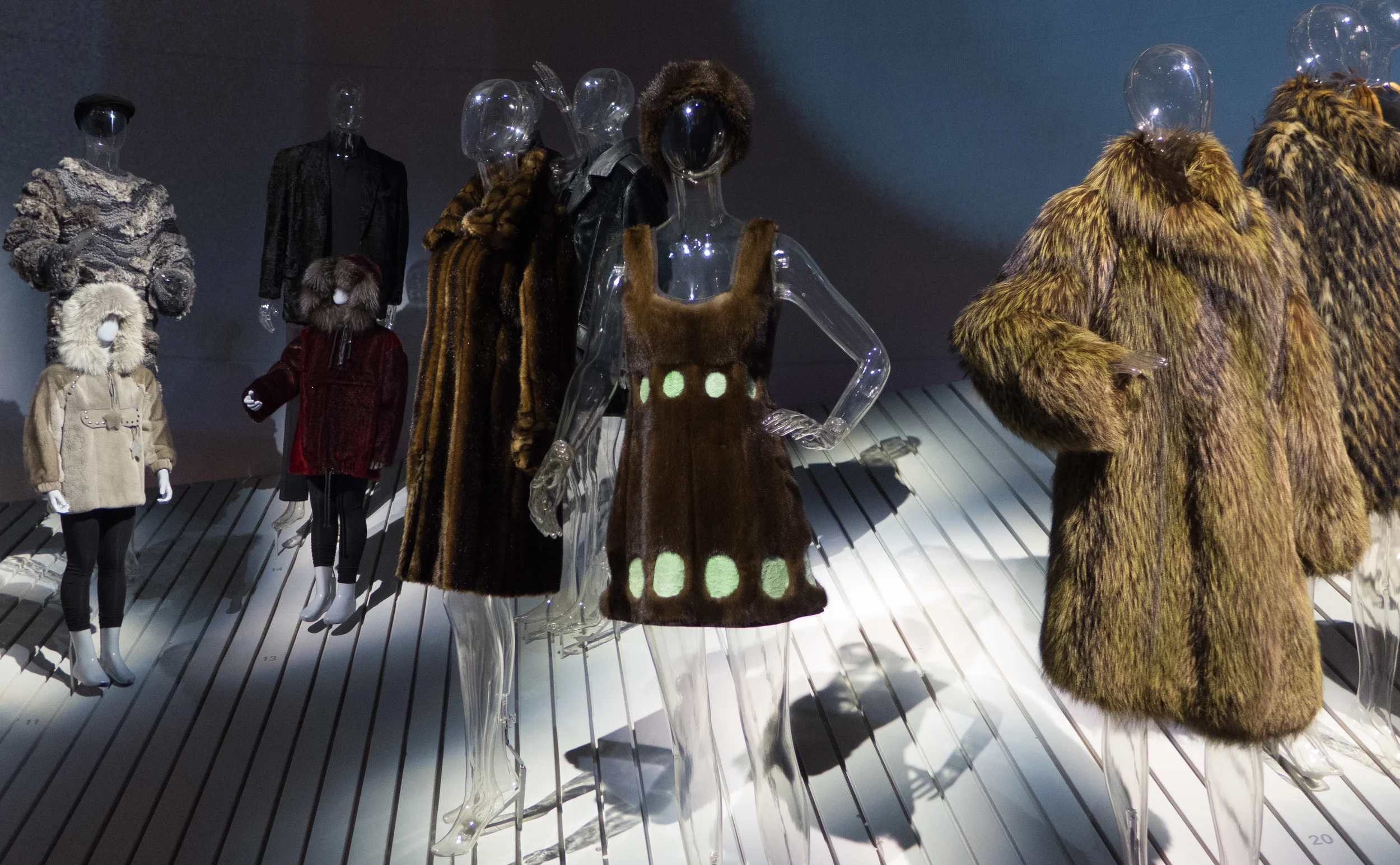
Information on audio tracks, phones or - much more common recently in exhibition - on dedicated touch screens overlaps closely with web sites in terms of how people look for information and want it presented. Arbejdermuseet (The Worker’s Museum) in Copenhagen has large flat screen - literally flat as they are laid down as table-top displays - with short tableau-like commentaries on labour movements, political background and so on with old photos and news film and it is presented in English as well as Danish. An amazing amount of data well presented. The exhibition about fur at the Natonalmuseet (National Museum) in Copenhagen had very large displays of costumes that were in controlled light conditions and there labels where almost impossible so carefully placed touch screens again gave a huge amount of information. 

But then if it all gets too much like a web site you get to a point where maybe the visitor feels they could have just stayed at home and downloaded the data.

In neither the Worker’s Museum nor the National Gallery was there any real overlap with books and, in any case, far more people will interact with a screen in front of the display than would ever spend money on an expensive catalogue from the exhibition … although there are, as always, exceptions. The recent Wegner show at Designmuseum had a really good hard-back book published to coincide with the opening of the exhibition and it was carefully balanced to attract both the general and the more specialist visitor and the success of this can be seen in the number of book shops that have stocked and sold that book. I am sure the more expensive and more specialised catalogue for the Kaare Klint exhibition will not sell in such large quantities. Unlike the internet, there is that odd paradox that the more you print, the lower the unit price and the more buyers or conversely if you are cautious and worry about having to pulp or remainder unsold catalogues it becomes a more expensive print run and inevitably you sell less because the cost is higher.

That brings me back to the initial question of the heading of this post. With this blog I am struggling to get right the amount of information I post and how I create levels of information so that readers can do that initial saunter through the gallery/scroll through the basic data or stop and dig down for more. 

I am on line the whole time I am writing to check facts and so on but curiously I still find books a quicker and easier way to get to information. For instance the web is still not good if you cannot remember a spelling … I’m not good at remembering names but often remember an initial letter or an odd combination of letters in a name and can find it very quickly in a traditional printed index.

Searching images through Google is getting better and better … for instance if you have an image of an item but no data then an image search can often find a useful site but until recognition technology improves that works better with downloaded images already on line than my own jpegs.

Computers and the internet win hands down for presenting huge quantities of high-quality images that would be impossible in even the most expensive book and of course it is incredibly useful to be able to post details or high quality images where the user can zoom in to see something. Links to other web sites for more images or more information, when properly set out, beat the comparable bibliography in a printed book and can take readers who want more information directly to the best sites.

Some web sites … particularly museum, gallery and library sites … have more and more information available on line and they are disciplined enough and professional enough to update and correct the material they have on their sites. Wikipedia obviously does the same.

But one problem I find more and more is that with so many blogs and sites about design out there, and that number increasing daily, then simple single-word searches are no longer enough to reduce the number of links or give any real sense of potential quality or real accuracy for the information. 

There was  an article in the Independent on-line news yesterday with the alarming headline “Britain may be forced to ration the internet, expert warns, as web use could consume 100% of nation’s power supply by 2035”

Clearly it’s not just the amount of information but ‘headlines’ that can get bloated way beyond anything that would be acceptable on printed paper. 

growing opposition to the new Nobel building in Stockholm

There appears to be growing criticism of plans for a major new building in Stockholm for the Nobel Foundation that has been designed by David Chipperfield. The scheme is still to be approved by the city council.

The problem is not the design itself but the proposed location in the centre of the city on Blasieholmen that is of concern. Ostensibly the site would seem to be ideal: a major water-side site for such a prestigious building and close to the National Gallery of Sweden and with views across the harbour to the Nordiska Museet to the east and to the gallery of modern art on the island of Skeppsholmen. But that is actually the problem. Although this site is right in the centre of the city it is an area where you still get at least a sense of historic Stockholm as a thriving and bustling port - not just a dock for ferries and cruise liners. 

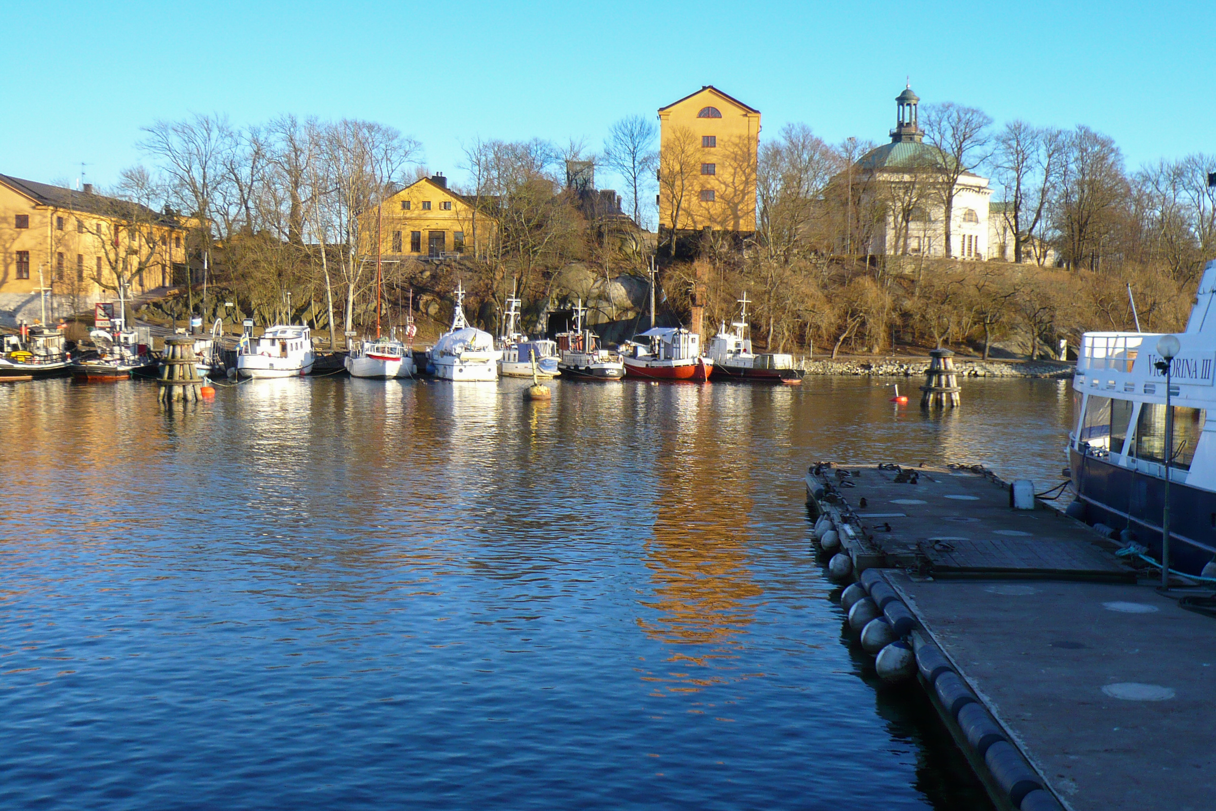
The new building would mean the demolition of the last two wooden warehouses on the quay that were built in about 1900 and the demolition of the Customs House designed by Axel Fredrik Nystrom in 1876. I thought I had a photograph of these buildings but I could not track them down … presumably they pre date my move across to digital cameras so must be in a box or file somewhere that I’ve lost track of with at least four moves of house since … but I do have a view across from the site towards Skeppsholmen. At least this shows the character of the harbour here. It is not a bustling port scene reminiscent of Hamburg or Liverpool at their height but people do forget that these great European harbours were also full of fishing boats, local traders, small ferries and boatmen shuttling around goods from one warehouse or quay to another.

This part of the harbour is not actually about big internationally important projects  … it’s an area of local boats and ordinary everyday harbour business and trade. The argument is that a great new building by a great or prominent architect revitalises an area but what could actually be more vital than this?

how can we understand more about good design?

Just before Christmas I spent a good part of a day looking around Arbejdermuseet, the Workers’ Museum in Copenhagen, and, following the chronological sequence through the galleries and displays, I ended up at the basement level looking at reconstructed interiors of some fairly typical Danish homes from around 1960 including the workshop shown above. 

It started me thinking … ok it started me reminiscing and then it started me thinking. 

When I was a boy nearly every home or rather, I suppose to be more precise, nearly every father had either a garden shed or a garage and the garden shed or the garage had a work bench and at least a few tools. The end of our garage looked much like this but not quite as neat … my father got curiously animated when he came across men who had peg boards with hooks and each hook with the outline of a tool that it was supposed to be home to. To be honest, my father hated DIY and in our garage, although there were hooks and plenty of tools, it was a matter of rummaging in a box to find something and inevitably it was going rusty or it needed sharpening. But the point was that when shelves were needed we went to a timber merchant for wood and an ironmonger for brackets and screws and somehow the shelves got put up.

My grandfather was better organised and had an amazing garden shed that I loved as a kid. Generally, he was banished to the shed to smoke - mainly because my grandmother was trying desperately to not give in and start smoking again - and I’d go out there with him. He had amazing stocks of screws and bolts, mostly kept in old tobacco tins, and weird and wonderful things that had been saved or salvaged and a large basket under the work bench with scraps of wood. Having lived through two wars and the Depression, he never threw anything away if there was even an outside chance he could find a new use for it. While he had a cigarette and I sat up on a stool, he taught me, by showing me, what oak is like and what the different pines are like and how to sharpen a chisel and by the time I was six or seven he had shown me how to mark out and cut a mortice and tenon joint and a dovetail and taught me how to glue or pin or use dowels to fix bits of wood together. 

side table from GAD

the drawers have proper dovetails

When I went on to senior school, I went to a grammar school where the focus was ostensibly on academic work but never-the-less we had amazing workshops and all the boys had to do carpentry, metal work and technical drawing so I learnt how to use workshop tools like circular saws; was taught to hammer and shape copper; did enamelling and metal cutting and soldering.

A couple of days before I stood lost in thought in the basement of the Workers’ Museum and got all misty eyed about 3in1 there had been an article in the news about a major DIY chain in England shutting half their outlets. 

So does anyone have a work bench now and does it matter if people no longer put up shelves or know how to cut a butt joint? … and no that’s really not a euphemism.

Well - actually - yes it does matter.

And before I go any further I wasn’t going to say that men should do manly things because everyone should understand a little about materials and about how things are put together and how they work. How can we be discriminating buyers of design - how can we begin to see if something is good or bad design - if we don’t understand how and why it was put together in that way? You don’t have to be a brilliant cook to appreciate a meal in a great restaurant but understanding a little about food and flavours and the cooking process helps you to appreciate just how fantastic the meal is and the more you understand music, whatever style of music you are into, the more you can appreciate it. Mobile phones, music players, computers and cars are now way beyond the stage where DIY repairs or modification are possible but it still helps to understand a little when confronted with a line of options when you go to buy something. 

So understanding timber; knowing where mdf should or should not be used; being able to spot cheap chrome plating; understanding where or when or why wool or cotton or linen is most appropriate for upholstery or seeing immediately that a drawer is shoddy and badly made and will pull apart within weeks all makes us better consumers and makes us more likely to be able to see where something is well designed and well made or badly designed and badly made and a false economy.

I’m not suggesting that every one should have a work bench and not suggesting that everyone can or should want to put up a shelf but we should be worried that the internet and the quick-fix of purchasing something new as soon as something breaks have infantilised us and there are certain life skills children need along with being able to swipe an index finger across a screen to find the right app. Is there an app that tells you that the printed veneer on that fake walnut coffee table will mark and lift as soon as you put a hot coffee cup anywhere near it? If something breaks, will that fixing fix it? Which glue does which job? Will that shelf bend or split as soon as something is put on it?

If more buyers are to understand what makes a good design good and that in part something is expensive because it is well made in high-quality materials then designers and design shops have to point out, be it in a subtle and discrete way, why it is good and well made and maybe even why the cheaper version is cheap.

If my father thought a man had been emasculated if he had the outline of a fret saw around a peg on a board to show him what should be hanging there, I’m not sure what he would make of someone going into a tizzy and typing angrily on Twitter because there they thought that a grub screw was missing from their flat pack. And no that isn’t a euphemism either. Maybe it should be.

do cheap copies of good designs matter?

Yes of course they matter. They are a serious problem in so many different ways.

For a start the term ‘replica’ seen in some adverts is a weasel word that really should not be used for the commercial production of current or recent design pieces. Of course a museum replica is valid, where it reproduces something that has been destroyed or lost or so badly damaged that it is difficult to appreciate or understand what it looked like originally but the word replica should not be used for what is a fake just because it doesn’t sound quite as bad.

So the right word for these copies is that … at the very least unlicensed and unauthorised copies … where the design has been filched or in some cases crudely copied or knocked off and knocked up or it should be described as a rip off or, bluntly, in many cases, a deception.

There was an article recently in Dezeen that came out with that old old argument that cheaper copies allow less well-off buyers to afford good design. The Robin Hood argument. 

So is horse meat in pies a reasonable substitute for people who can’t afford prime beef? Is perfume sold on a street corner with very dubious ingredients that irritate the skin fine because people who can’t afford the original can afford the fake? Wonder if he would argue that a great song is exactly the same whoever sings it? Is his furniture - sold to help the poor buy good design - sold at cost? Thought not?

Read More

and the award for humour goes to ….

My award for wry, self-deprecating humour goes to Paustian. 

If you asked any visitor to northmodern if they saw the Kellogg’s Corn Flakes they would probably give you a very odd look. 

As you entered the first exhibition area, the first stand, straight in front, was by Paustian, the well-established furniture store from Copenhagen. They had displays on both sides of the main route into the fair - good displays of a wide range of new and well-established makes and designs - but if you looked back, back the way you had come, there was a display with their Modular Sofa in a very good soft blue/grey fabric but with books, a key board, toy soldiers and an Aalto Stool 60 with a tray balanced on top and the remains of an interrupted breakfast with a packet of Corn Flakes, opened, flakes poured into a bowl and a carton of milk … slightly retro and very tasteful clutter but never-the-less still clutter from a fairly normal life. 

My suspicion would be that if the average Paustian customer does eat Corn Flakes - rather than Bornholmsk Müsli or something from Strangas - then they at least decant them first into a stylish container.

But the Paustian team were making a point in a gentle way. Focusing on design, worrying about the economy, watching the competition, looking out for the copyist who is out to steal your best ideas … it is too easy to forget that all these fantastic things end up out there in the real world. In the real world where kids have sticky fingers, the designer chair is somewhere under a pile of clothes - because it’s no longer fashionable to have a wardrobe - and no one can remember if the Royal Copenhagen china their mum gave them is retro, ironic or wrong.

northmodern is an "innovative furniture and lifestyle trade show" and Paustian were one of the only companies to address that lifestyle bit ... in their own way.

My award for unscripted humour goes to ….... Paustian. 

I was standing talking with the Paustian team and suddenly realised I was no longer the focus of their attention. I turned round - looked in the direction they were looking - saw this and had to take a photograph. 


At a design fair, if you want to get a better viewpoint for a snap - she is taking a photograph -then I suppose you might as well stand on a design classic. It was possibly a good thing that it had not been a three legged Stool 60 that had been to hand … or really I suppose … to foot. Note … she did protect the top with a sheet of A4 paper.


An award for making me smile has to go to Phillip Grass. I first saw his work at Designtrade last Autumn and the version of his stool with its elbows on its knees, hands clasped up to its cheeks and thinking or looking pensive makes me smile every time I see them. There is a phrase about being left on the shelf … the photo I took last August shows that it might be just as bad to be left off the shelf and ignored. Who knew that a stool could look as if it’s sad and sulking?


photographs from northmodern

Generally I really want to take my own photographs at an event like northmodern. Sometimes designers and companies, quite rightly, look concerned … without doubt there are sharks cruising the aisles looking for the idea or even the whole concept to steal and get out fast and cheap and they all have cameras … so I spend quite a bit of my time explaining why I’m interested and why I’m taking photographs.

There are now usually links to a design web site with high-quality publicity shots but often I want to photograph from an odd angle … not to publish an odd photograph but because it is a note to remind me about something or some detail I really liked about a design. And of course, at an event like northmodern, you are seeing so many things in such a short space of time that taking a photo of a name tag or brand logo helps with getting thoughts and impressions sorted out later.

Also, a company’s publicity photo may look too like a magazine shoot and often a slightly less flattering view is more like the appearance the piece will have in a home … when it’s out there in the real world. 

buhtiq31 - the Dutch group of designers were super professional with their information pack which included a plastic clip holding together business card, postcard and information sheet but the clip was also a memory stick with details about the designers, great photos and a look book. As an aside … this is how it should be done: not the specific details of how it was done by buhtiq31 but the level of professionalism - these days there can be absolutely no excuse for using a poor type face or a cheap paper because if that’s what a designer does, however good their product, poor presentation inevitably undermines their credibility.

Of course there are always problems trying to take photographs in a situation like this … not least odd lighting because, for instance, you can’t ask someone on an adjoining stand to turn off a light because it's creating an odd shadow. Yesterday I had just focused on a stool and it was the right angle of view and there was no one walking behind in weird shoes and at that point a bloke walked up, turned the stool through 90 degrees and plonked his back side on it … but how could I complain? He was clearly a buyer and I am clearly not. I never did get the photo.

One photograph I did get yesterday was on the Menu stand. This is the WM Dining Chair designed by Studio WM - the team of Wendy Legro and Maarten Collignon from Rotterdam. I’ve just said I go for the in-your-living-room shot and of course this is anything but that … do you stand your chairs in splendid isolation against a soft-focus mirrored surface in your living room? … thought not ... but even I can’t help but feel chuffed when sometimes I get an arty shot.

a second day at northmodern

Again it was the diversity that impressed me.

Yesterday I wanted to look at everything to get an overall view and today I went back to see the work of a selection of designers, retailers and manufacturers.

My guess would be that for many customers - the man in the street - or to be more precise the man or woman walking into a store - searching for something for their home - a furniture shop is a furniture shop is a furniture shop and what varies is the price or what they see is an overall style that they like or one that they don't. They don't understand the design process and don't understand the various ways that the manufacturing and supply chain works. And maybe they don't have to.

To the customer - or to most customers - or until recently - until the recession and the internet brought radical changes - the sequence is simple. Something is designed - it's made - and it's sold - and they've bought it - because they like it or need it.

Of course for the designer the reality of the sequence is so much more complicated. Here at the fair were young designers with a single design prototype they want to bring into production somehow and that may be sold through a single retailer or could be marketed through the internet; there were designers here with a single product but well down the line with finding the right manufacturer, designing packaging, getting out advertising and pushing hard at the doors of retail outlets. There are independent design stores that have a carefully curated collection to offer their customers - so they will go for a specific style of design or specific designers who produce what they want to sell. Several retailers have taken the next step by commissioning designers to design things they want to sell and they think their customers want so in those cases the product is often produced in partnership ... the retailer helping the designer modify the design for the target market of the store. There are major retail stores who commission nothing but maintain a well-deserved reputation by using their expertise to select the right items to sell, usually from a number of major manufacturers, who in turn may or may not have in-house designers, but the retailer knows the makers and knows their customers, so act, essentially, as an enabler, the middle man, the traditional merchant, and then there are the major design stores, companies who have carefully honed a style, their USP, and commission designers to produce exclusive furniture or household items that add to their catalogue of pieces that are in their company's recognisable style - the design shop as a clear brand who are taking on board some of the methods of marketing of the fashion industry.

There were a few product designers at northmodern who have the confidence and the drive to design what they feel passionate about without a specific commission; there were some designers who work to an individual commission, designing a one-off for one client and there were even more specialised and tightly focused designers - so Ole Palsby Design are producing and marketing a design that is Denmark's design heritage - or at least a very famous part of it - or I met and talked to the colour designer for the paint manufacturer Flügger who is also their product designer.

I'm sure that very few of the buying public would think that there could even be such a thing as a colour designer because, to return to my earlier supposition, for the average customer - standing in a design store - a colour is a colour is surely, they would think, just a colour and that doesn't need a designer.

Anyone with a stand at northmodern - so anyone who works professionally as a designer or as a retailer within the design world - would say that all this is a given - and it's inane to spell it out. But in fact how many of the customers - the people who ultimately buy the pieces here - understand those subtle and some not-so-subtle differences? Is it actually easier that they don't understand those differences? Would it make them more informed buyers if they understood more or thought more about the why and the how and the who of what they are buying? Or would it simply make the job of getting them to buy good design even more difficult?


An initial selection of my photographs from northmodern:


POCK'IT - a design project in smoked oak by Aviaaja Ezekiassen from the School of Architecture in Aarhus 


desk and stationery boxes by Christoffer Jørgensen of Manufakture

steel and leather chair from Jasper Overgaard and Christian Dyrman


sofa and wine glasses by Maarten Baptist - buhtiq 31 


the Form range of chairs, stools and tables by Simon Legald for normann copenhagen


Titanium range of cutlery from OLE PALSBY DESIGN


Stilhistorisk Farvekort - the historic colour range from Flügger

northmodern

I've spent the day at northmodern - the design fair at the Bella Center in Copenhagen. It's astounding to see so much design talent and all in one space. It's the quality of design and the diversity that's so impressive ... and it's across the board from the well-established companies ... like Muuto and Normann ... to the small, one-designer companies with the drive and vision to do everything from marketing to packaging to PR in order to get their new designs and products out ... and there is also the work here of recent graduates straight out of university with new ideas for new products. 

Planes stacking over Heathrow coming in to land one after another is impressive. Denmark does that with designers. Denmark has amazing designers in a holding pattern over what has to be one of the most important design hubs in the World. OK a cheesy way of trying to expressive something that I feel very strongly about.

Seeing so many good designers producing so many great things is inspiring ...

... even if inspiration and a little too much enthusiasm do odd things to my prose.

I’m back at northmodern tomorrow taking photographs and talking to designers and then I’ll start trying to post all that on this blog.

There are some changes planned for this blog. Moving to Copenhagen I’ve not stopped grinning inanely as I take photographs of pavements and power stations and metro hoardings but posting about all that here has tipped the balance of this site … too much architecture and too much Copenhagen.

So I’ve started a second blog to run in tandem - copenhagenbydesign - and from now on that is where you can find my thoughts on architecture and planning and the history of building in Copenhagen.

This site will focus more and more on the best design from the region and the design process … what makes good design … how designers work and how they develop a design and how they progress as designers … how good designers build on a craft and design heritage … or not.

It will still try to cover design in the widest sense and still try to look at inspiring design in all the Nordic countries. Each country has a specific and important design heritage and taste and style differ from country to country in ways that maybe people from outside Scandinavia do not appreciate or understand but there is also a strong common ethos and strong common sensibilities to light and nature and a sense of colour and sense of space that can be seen as distinctly northern.

copenhagen by design is still with Squarespace but uses a different template that deals with photographs in a different way and I will probably move Nordic Design over to that template because images are crucial to a design site.

Comments and feed back really are helpful

John - 19 January 2015

Fur - An Issue of Life and Death


At one extreme you get people whose whole life revolves around design - names, companies, styles, the latest and the best - and at the other extreme people who insist that they know nothing about design - state categorically they are not interested in design - and normally finish by saying that they simply know what they like.  Curiously, it is often those very people, the non-designers - who are wearing the latest and the best training shoes and judge people they meet by the label on the jeans they are wearing. Fashion is the one discipline of the design World that people who do not work in the design World actually do often know about. 

Although I like buying good clothes and despite spending much of my time thinking about design, I’m not actually that interested in fashion - the reason why posts here about fashion are few and far between. I’ve never been to a fashion show and I can only recognise the most obvious designers if shown an outfit. For that reason, and also because I do have misgivings about fur used for fashion, I had not been to the current exhibition at the Nationalmuseet in Copenhagen - Fur - An Issue of Life and Death.

I was at the museum on Sunday in the shop trying to track down a book I wanted. Half way out of the door I thought that as I was there I might as well have a quick look at the exhibition and actually I was very glad that I did.


This is a beautifully presented and very clever and thought-provoking exhibition.

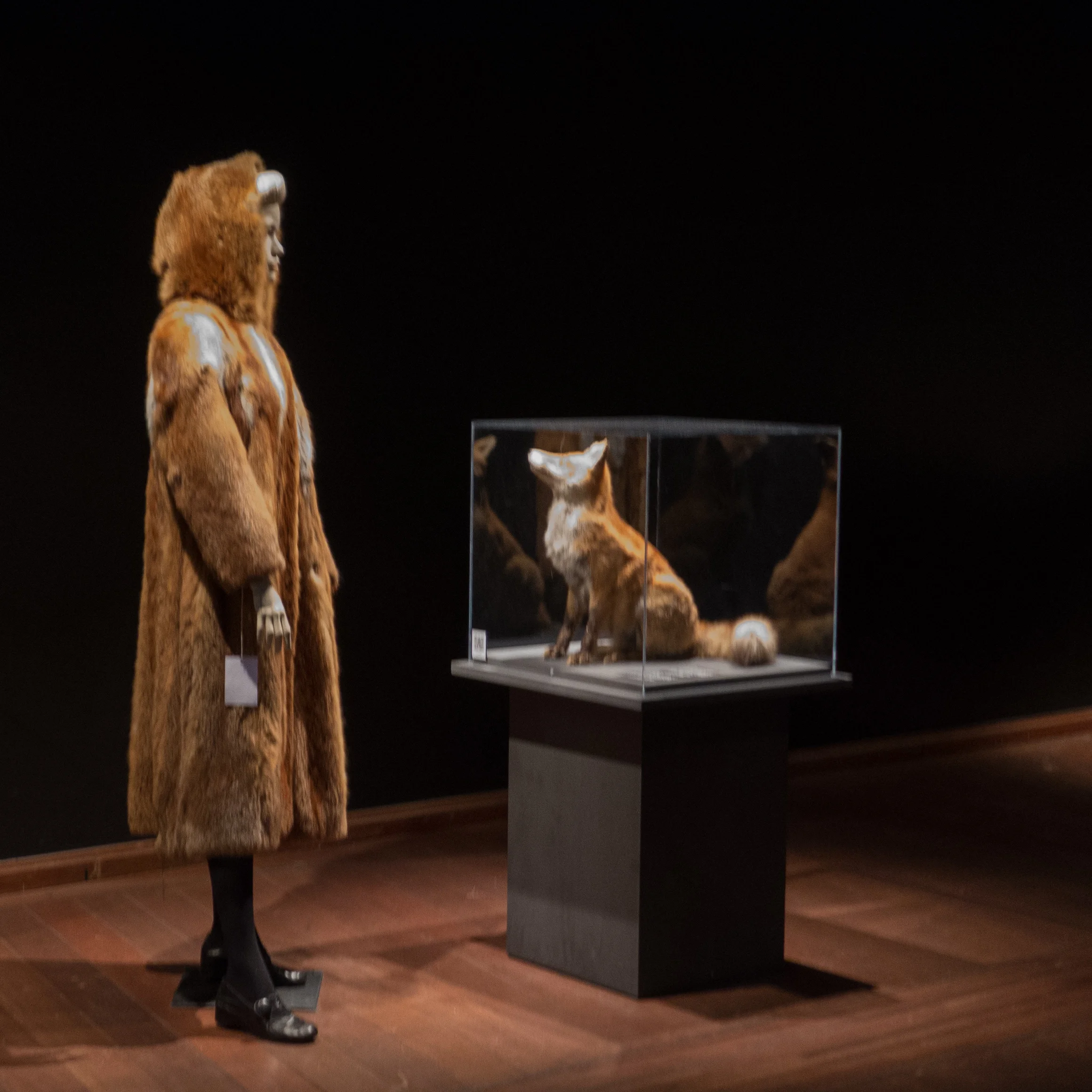
The two main displays face each other across the space with a curve of mannequins wearing traditional clothing from Greenland, North America, Siberia and Scandinavia facing an arc of figures wearing ‘fashionable’ clothing in fur.


At the centre - between fashion and tradition - are very informative displays about the raising of animals for pelts and about traditional methods of hunting and preparing the skins. The labels are completely unbiased, non-political, simply presenting the information and statistics without comments … for instance there is a straightforward map of Europe that shows which countries allow farming of animals for fur and those countries where it is banned.


Interactive displays around the edges are, in some ways, more interesting, encouraging people to decide. There are panels where you can feel samples of fur and have to guess if it is real or fake before lifting the flap to reveal the answer; there are interviews with people on the street asking them about what they think about fur for clothing and asking them why they are wearing natural fur or why they are wearing fake fur and there is one area where visitors can try on a range of fur coats and stand in front of a large projected image to take a selfie but by swiping a touch screen they can select different backgrounds for their photos from a grand interior - suggesting curiously that maybe fur was OK for grand people living in grand house? - to a fashion cat walk to an image that puts you in a fur coat standing in front of an anti fur protest.

The use of new technology here for information and for labels is superb - I particularly liked the use of a thermal imaging camera where you can hold in front of yourself or wear coats in different fabrics and in fur to see how much or how little body heat escapes - and fur does do a very good job of keeping you warm.

The traditional costumes are amazing both for their diversity and for the incredible craftsmanship. And there the ethics question is maybe easier because fur is a natural material and was all that was available. 

If you don’t want to confront your own political and ethical views about the use of fur for fashion clothing it is still well worth going to see the exhibition just look at those traditional clothes. 


The exhibition at Nationalmuseet continues until 22 February 2015

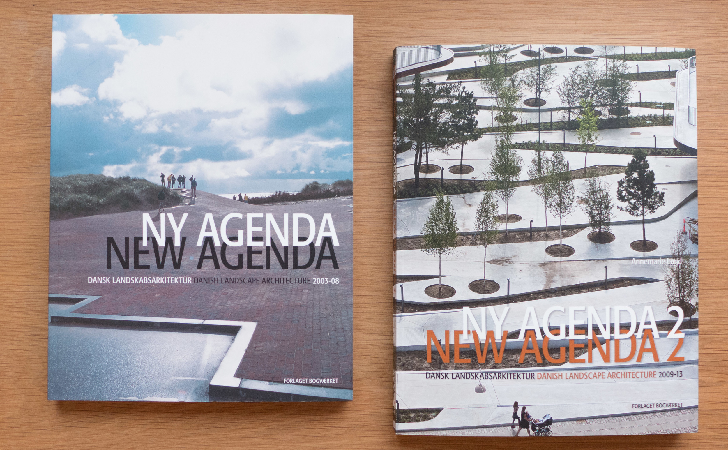
Ny Agenda 2, Danish Landscape Architecture 2009-13

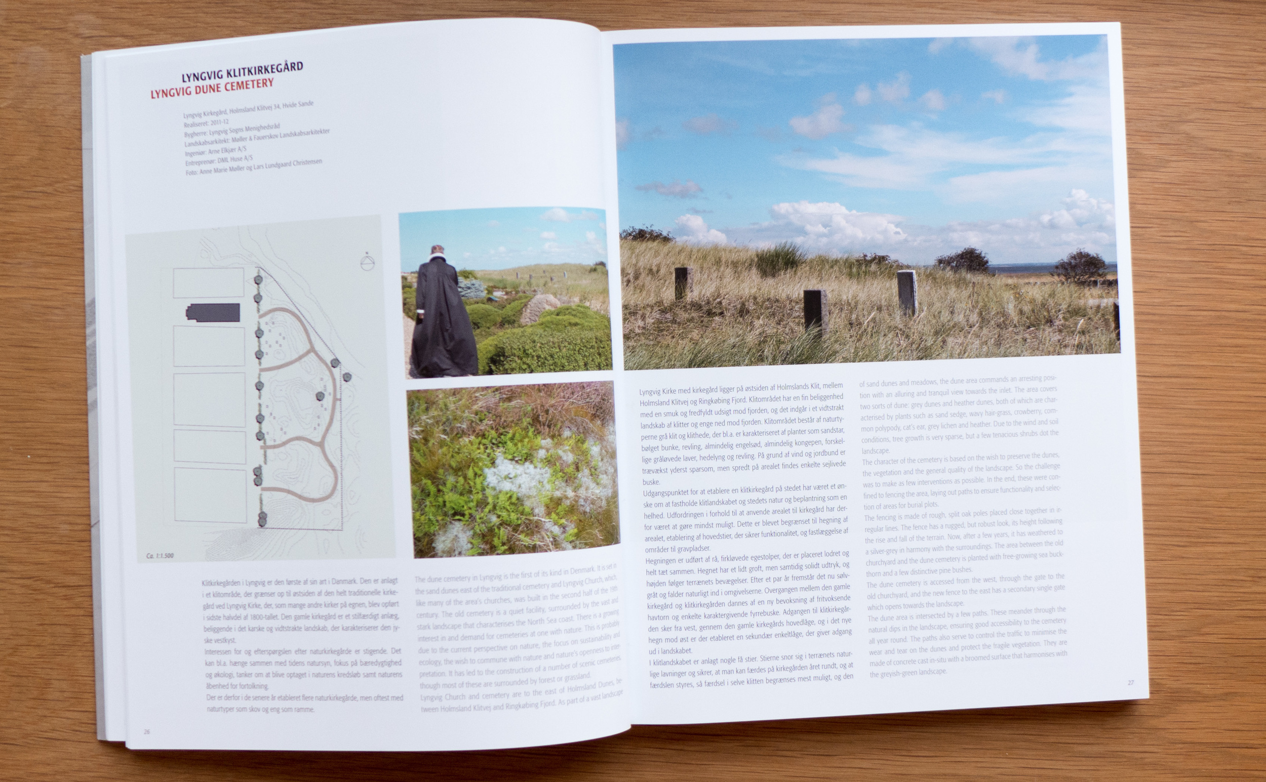
This second volume of Ny Agenda covers 39 landscape schemes from 29 different offices that were undertaken and completed between 2009 and 2013 - a final selection from 109 submissions. These have been grouped into five sections - New Sobriety, Heritage Reinterpreted, Exercise through Play, Urbanisation and Climate and Growing Power After All - to cover major trends identified in design in landscape architecture over the five years. There is a foreword and an essay by Annemarie Lund on Old-time Values and an essay by Lisa Diedrich on The Danish Way - A European Glance at Danish Landscape Architecture.

In her essay on Old-time Values Annemarie Lund argues that the criteria for recent awards for landscape design - sustainability, sculpting of the terrain, quiet spots and a better place to live - reflect qualities and values for which Danish landscape design has been appreciated and admired since the middle of the last century. But some newer trends are identified with an increasing awareness of the value of appropriate landscape changes to encourage and help people to exercise and of course changes determined by our response to climate change whether that is growing food or dealing with patterns of heavier, more intense rain fall.

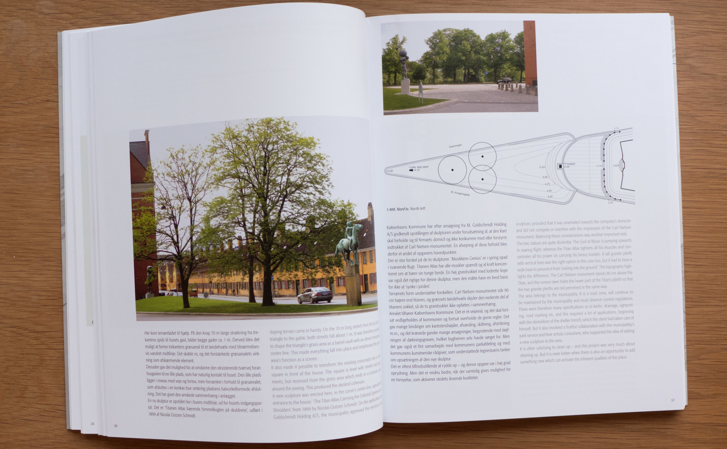
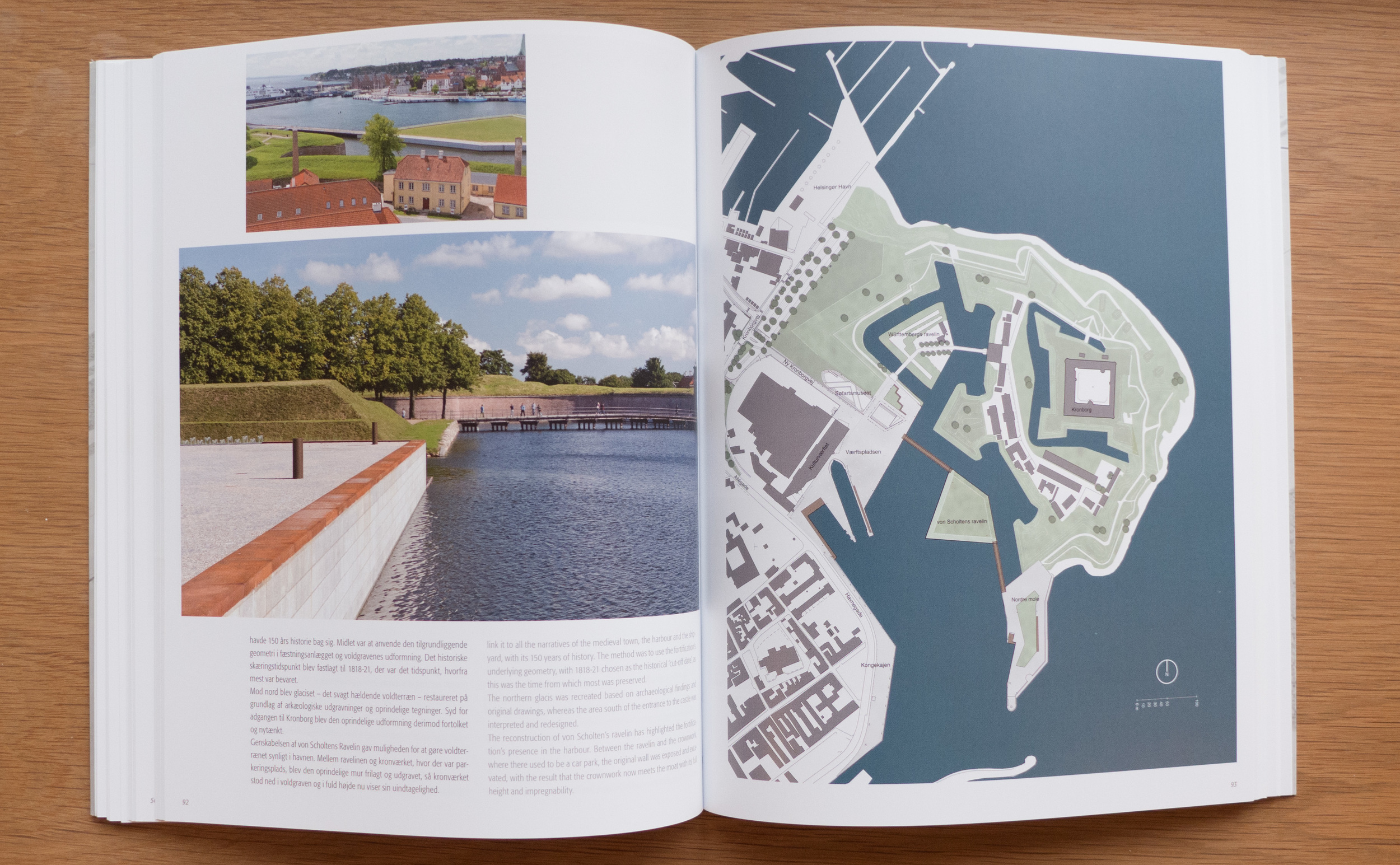
Generally, the schemes are presented as a double-page spread although major works are taken over four pages and the monuments area in Jelling, the foreshore park around the National Aquarium, the Fredensborg Palace Garden, the new garden in front of the renowned restaurant NOMA and the landscape around the castle of Kronborg are each given 6 pages but all with a clear and simple layout with a two-column design to allow for parallel Danish and English text. Photographs are superb and there is a good use of drawings and the team involved in each project is listed. Together this means that the book can be used with a computer to use the internet to call up maps, particularly for Copenhagen the Google 3D maps, and information from company and city internet sites to provide context or a broader or deeper level of information about specific places.

What comes across strongly is, that if any aspects can be seen as common to these widely diverse and varied landscapes, it is the Danish determination and persistence to use the very best materials as a matter of principle, investing in the future, but also to show courage when dealing with historic towns or major monuments to both try and to succeed with innovative or radical ideas.


Annemarie Lund (editor), Ny Agenda, Dansk Landskabsarkitektur (New Agenda, Danish Landscape Architecture) 2003-08, Forlaget Bogværket (2009)

Annemarie Lund (editor), Ny Agenda, Dansk Landskabsarkitektur 2 (New Agenda, Danish Landscape Architecture 2) 2009-13, Forlaget Bogværket (2014)

Biography

Yesterday I went back to take another look at the installations by Elmgreen & Dragset at the National Gallery of Denmark in Copenhagen … I had been thinking about my first visit and wanted to look at the pieces again before the exhibition closes on the 4th January.

The three large-scale installations, under the general title Biography, feel initially very different in atmosphere and feel very different in the way the viewer looks at each one. The main work, The One & the Many, has been erected in the entrance hall of the gallery and is the representation of a stark, three-storey apartment building. There is an entrance door but it is locked so we are kept out and, as on any public street in any town or city, our view in is restricted to what we can see through windows. The rooms we can see into are completely realistic using appropriate furniture and curtains and personal possessions to make the viewer feel, almost too easily, that they can understand the ‘back story’ of what appears to be the sad, lonely and alienated lives of the tenants of the block. What is surreal is our position … we are outside and when we take our noses away from the window glass we are suddenly back in an art gallery.

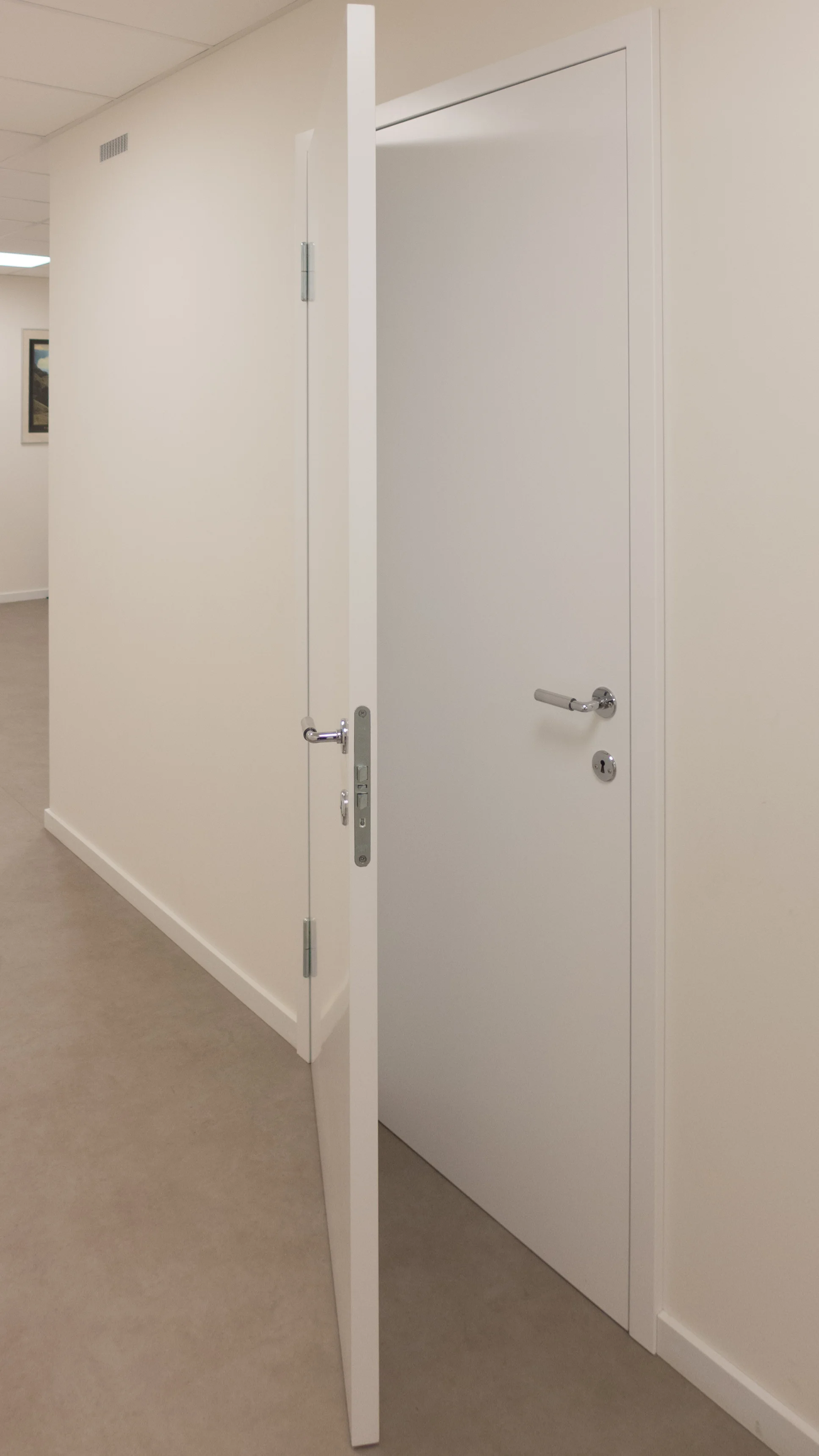
The second gallery space is completely the other way round in that there is absolutely no sense of an exterior. There is a corridor and we have a choice of which way we turn but in the end we come back to same point anyway. There is a sense that this could be a characterless standard, scruffy and barely maintained government or town department with waiting rooms, ticket offices and even a toilet but there are no staff … no signs to tell us we have come to the right place. It is the extreme of de-personalised public space but everything is surreal. Everything is wrong and frustrating: one door has hinges and handles on both the left and the right side so could not open; another door opens to reveal another locked door immediately behind it; the basins in the toilet have the most weird plumbing and so it goes on. Again the sense is of alienation but this time ours on entering this parallel world.

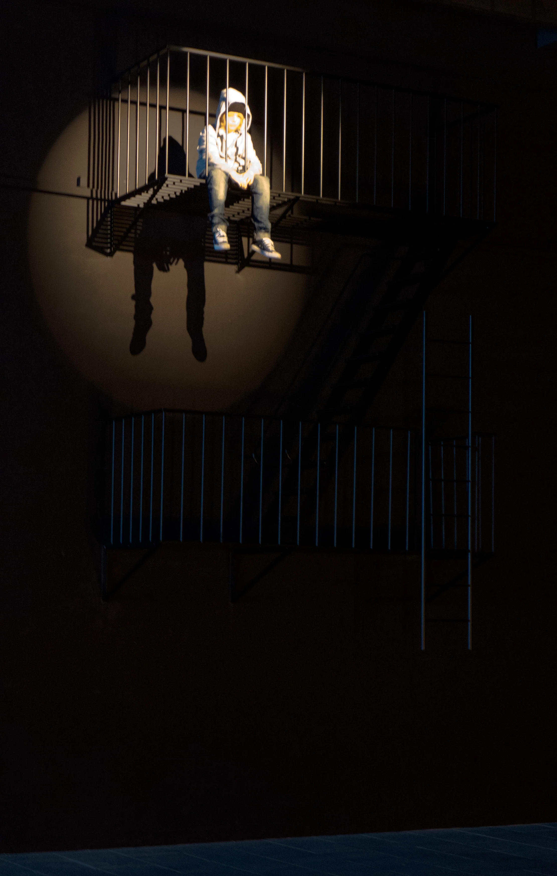
The third gallery appears to be a continent away … Las Vegas, the ultimate city of escape and dreams ... a Las Vegas night … a fire escape with a bored teenager sitting there high up his legs dangling over the edge … a mobile home broken by a fallen sign … and … most disconcerting of all … the swimming pool of a motel beyond a chain-link fence … guarded by a snarling dog throwing itself at the fence … and with the body of a man floating face down. These are the images of a fractured and alien world … or at least alien to Copenhagen. I actually know Nevada fairly well and this violence and darkness is not so implausible there. For someone coming from western Europe then arriving in California, Nevada, the Mid West it can feel as alien and surreal as this. 

What has all this to do with a blog about design?

That’s why I went back. On my first visit I looked at the installations as I would many art exhibitions … as a fascinating insight into the view point of the artist and as an interesting comment on contemporary life … 

Then thinking about it I realised that much of the impact of the show and the way the artists get us to look and think is to view modern architecture, modern graphics, everyday furniture, popular taste and style, with the clinical, detached observation of a cartoonist or a satirist. Their view is not hard or unsympathetic - in fact just the opposite - but never-the-less they are detached and frighteningly analytical. Each room in The One & the Many has an inherent coherence that allows us to guess at the age, sex, character of the tenant. The wallpaper is right for the character they have created, the style of furniture or lack of furniture, the books and magazines or the lack of books and magazines, the pictures on the walls are all the things that character would have chosen … or rather … because the artists chose them we project onto the rooms our preconceptions about what a person like that would be like. That’s fine. We are above that out here in the real world outside the art gallery. We don’t judge a person on their clothes. We don’t judge people for their taste in carpets. Fine.

But actually look around you right now. Look at what you have bought recently.

In those rooms in The One & the Many even the food packaging, the typography of the books and magazines, the colours chosen were all consistent and are all so revealing. Do we really expose so much about who we are whenever we choose one product over another? Facebook and Google would like to think so.

Aldi or Irma, IKEA or Illums Bolighus, Berlingske or Politiken all judge us … and chose the typefaces, the colours, the sizes, the options and variations they choose to offer us … because they know us … or think they know us … or hope they know us … their core audience.

So successful design has to be about anticipation and manipulation? 

Is good design the design of an object that will end up in a museum collection? Or is good design the design that sells and allows the manufacturer to survive if not thrive? Is good design what we like or what a marketing man thinks we will like? Is good design the design of an object we see and decide we really must buy or is good design the object we buy because we have seen the ad that makes us realise we want it? Is good design the object that looks amazing or the object that works day after day in the background?

And finally - to flip it around - if we put up with bad design or, come to that, choose to buy something that we accept is badly designed ... what does that say about us? Generally I guess it is usually that we don't have the time, or the money or the energy to search out the alternative. In part, what Elmgreen and Dragset are saying is that as life becomes more difficult and people become more isolated then clearly good design or any choice between good or bad design becomes less and less relevant.

And on a lighter note I missed an amazing photo opportunity yesterday as I stood in the gallery looking up at the figure of the boy sitting high up on the fire escape wearing his hoodie and jeans and trainers. A teenager came into the gallery wearing a hoodie and jeans and trainers plus a baseball cap on backwards and he walked or rather scuffed along under the fire escape and peered through the wire fence at the body floating in the pool; shrugged; turned and scuffed out without looking up at the boy, or the representation of a boy the same age above him. I didn’t get the lens cap off my camera quickly enough to capture the moment. It was surreal. I felt old and tired ... alienated … an observer.


Biography, Michael Elmgreen and Ingar Dragset, Statens Museum for Kunst, Copenhagen

Continues until 4 January 2015

DANISH™

DANISH™ is a new magazine published on line to promote Danish design and architecture. It has been launched by the Danish Design and Architecture Initiative, formed in 2012, and commissioned by the Ministry of Business and Growth, the Danish Ministry of Foreign Affairs and the Ministry of Culture.

Good straightforward typography and the restrained but stylish graphics with a good use of strong colour and horizontally scrolled bands of photographs all show that the site was designed from the start to be viewed on a tablet or touch screen … the side swipe for moving through the bands of images is the give away of course. However, there are still problems with reconfiguring sites to work on multiple platforms so actually the site does really still look best on a large screen that does justice to the high-quality images but also simply because on a larger and higher resolution screen text, images and columns of information and links appear in the relationships and sequence intended whereas seen on an iPad, normally held vertically in portrait format, some elements are rejigged and shunted to the bottom of the page.

This is really just carping and in any case is a general problem not specific to this site.

It is good to see the integration of short films including one from Carl Hansen about the Wishbone Chair and hopefully this suggests that, as the site builds, there will be more interviews, profiles and shorts about techniques and manufacturing methods and interviews with architects and designers. They presumably have the budget and the access to professional teams to commission filmed profiles of standing buildings and urban and rural landscape settings to take on-line reports on 3D design to a new level. 

Categories that drop down from the top navigation menu include architecture, art, craftsmanship, events. lifestyle, sustainability and urban development. 

There are separate profiles of Danish companies that already include the architectural practices of C F Møller, Schmidt Hammer Lassen and Norm, design companies including Kollision with entries for the furniture manufacturers Republic of Fritz Hansen, and Carl Hansen, and the lighting companies Louis Poulsen and Le Klint.

Each profile has a short pen portrait, supplied by the subject, with good photographs, the address of the company and links to their web sites. Clearly this will build up quickly to form an important access point to a directory of Danish designers, architects and manufacturers and retailers.

The site promises a monthly newsletter and from the outset the magazine seems to be fully integrated with postings to social media, including Facebook and Twitter links, which indicates that news and updates will be posted promptly.

DANISH™
a typeface for Sweden

When this story was first published on blogs and web sites at the beginning of the year, I managed to miss it but it has, for some reason, just appeared on Gizmodo and been reblogged on several other sites.

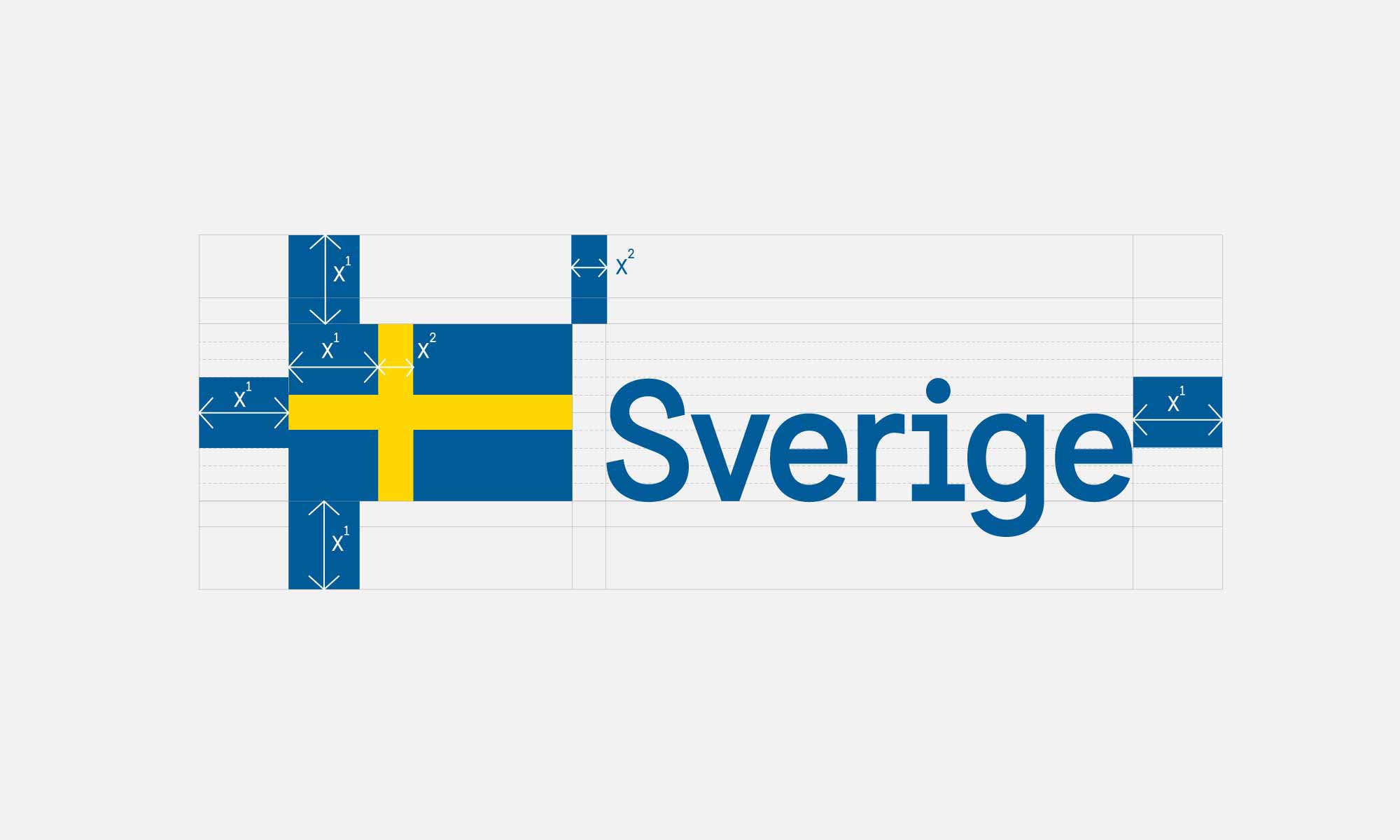
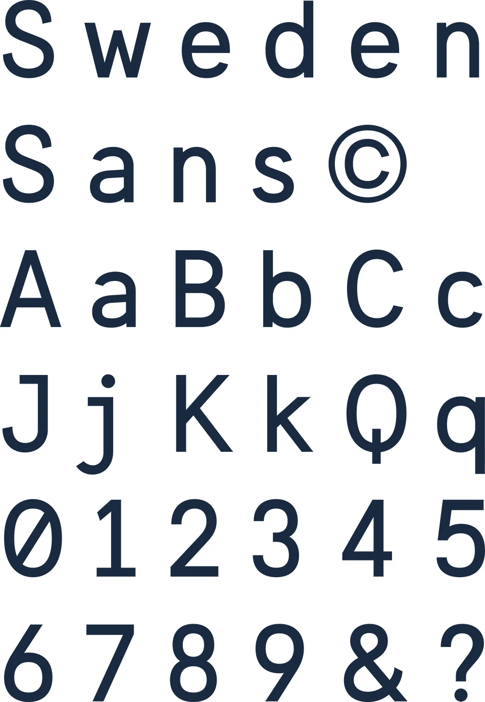
The design agency Söderhavet were commissioned to rebrand the official and national and international graphic face of Sweden and as part of that project Stefan Hattenbach designed a new typeface called Sweden Sans. Jesper Robinell, design director at Söderhavet, discussed the brief for the typeface on the company blog. It had to be distinct, “inspired by classic Swedish street signs, with blended mono-type and san-serif accents that clearly show a Scandinavian heritage.” Also the typeface had to “unambiguously convey the 50+ translations of “Sverige” into local languages.” What was also significant was that, in the words of Stefan Hattenbach, the typeface had to be “natively web friendly, so that readability on display screens is perfect.” People, brands, companies and now countries have to have a presence and an appropriate presence in digital space.


When the typeface was launched towards the end of 2013 there was clearly a mixed response … mixed in the sense that some praised it because they saw it as retro, others praised the minimalism and some thought it was stylish. All very and rightly positive although some compliments seemed rather more ambiguous as it was also described as too Swiss, and, most curious of all, “very IKEA.”

These days, the general public understand and follow re-branding exercises for large companies or for well-known products or even for cities if they are hosting a World Cup or the Olympics. Rebranding of the BBC or New York Time’s web site’s is scrutinised initially, particularly if some popular pages or services are more difficult to find or use because they are in a different place, but most people quickly adapt and quickly forget what the old design looked like.

The need to unify the official publications of a country is much more important: I am curious to know how the new brand identity for Sweden has been received over the year since its launch.

Typeface design and the appropriate and proper use of fonts and type require incredibly important professional skills but unfortunately designers rarely get the credit and recognition for that work that they deserve. There seem to be two obvious problems. Like much design work, when the designer gets everything absolutely right, no one notices but as soon as they get it wrong then everyone, or at least other designers, notice and have an opinion to offer. The second problem should be laid at the door of Microsoft and Apple. Generally, the public do not understand or appreciate either font design or graphics, unless again a designer or company gets it very wrong, and most people think typeface selection and layout is easy … surely you just select the template you want, type the text, highlight a block of words or a heading and go to the drop-down selection of fonts. Easy. If you are not a font designer then go to the Söderhavet blog and find out how complicated and how important the design of a typeface is.

Design from Finland mark


Brand design agency Werklig,  based in Helsinki, have produced a new mark for Finnish design. It was commissioned by the Association for Finnish Work who grant permission to use the official mark to companies who “invest in design and understand the value of it as part of their business strategy.” 

The clean, strong blue of the background and the simple white graphics echo the Finnish flag and the containing circle, like that of the Iittala logo, works at various scales - either as part of a larger label or as a small, stand-alone stamp or tag on items like drinking glasses or tableware.


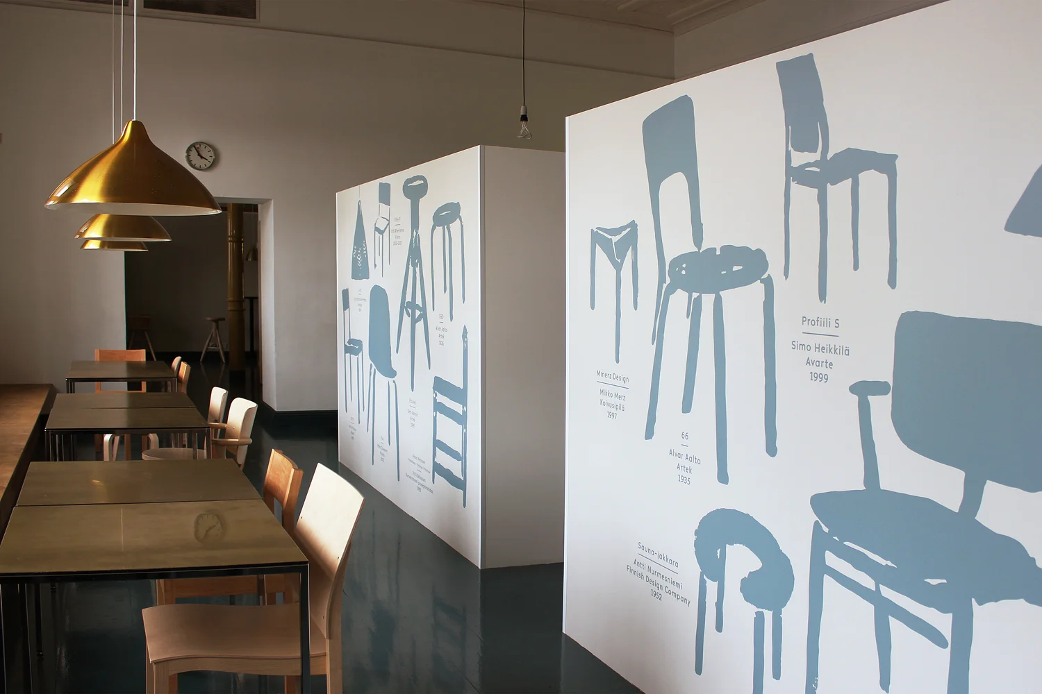
Looking at the Werklig site they have undertaken some interesting projects since they formed in 2008 including the design of a new font for Altai glassware; a travelling exhibition to showcase the work of Pekka and signs and information panels for the Design Museum in Helsinki.

When I saw that work in the museum I appreciated how the combination of strong plain colours and straightforward, stripped-down graphics works well with the architecture, including historic features such as architraves and cornices and so on, without competing or dominating. In fact the large information panels enhance the spaces and gives the architectural features a stronger rhythm. The architectural fittings of the interior merit retention because they are part of the original building but are actually rather plain: the building dates from 1895 and it was a school until taken over by the Association of Applied Arts so it is not surprising that the architecture is robust but not elaborate. The nearby building of the Museum of Finnish Architecture dated 1899 is much more sophisticated in terms of major fittings such as an elaborate staircase and in the treatment of the sequence of spaces.

The photographs of graphic work in the Museum of Design have been taken from the Werklig web site.